The best explainer video examples are the ones that name a problem you already have before they name themselves, and by that standard most of the famous ones are worse than their reputation. We scored fourteen real, public explainer videos against the same eight criteria, out of sixteen points, and published every mark. The average came to 10.9. Nothing reached 16. Seven of the fourteen never reach a problem the viewer recognises within fifteen seconds, and five never name one at all.
The short version
Every list of explainer video examples on page one describes its picks. None of them grades them. The fifty-example list that ranks at the top gives each entry a brand name and a video title and no analysis whatsoever. So we built an eight-point rubric, scored fourteen real videos out of sixteen, and published the marks including the bad ones. The average came to 10.9 out of 16 and nothing scored full marks. The failure is not craft. Animation focus, style discipline and plain-language comprehension all scored well. What collapsed was the opening: seven of the fourteen never reach a problem the viewer recognises inside fifteen seconds, and five never name one at any point in the runtime. Those are the two criteria that every incumbent criteria list puts first and that no incumbent list actually checks. The median runtime was 109 seconds against a practitioner ceiling of 90. And the finding that matters most for anyone commissioning one: score does not predict views. The four least-watched videos in the set averaged 12.25 out of 16, the four most-watched averaged 11.25. A separate first-party audit of that top-ranking list found six of its fifty videos no longer play and only twenty expose a public view count at all. FORKOFF does not make explainer videos. We audit whether videos get watched, across a clipping network that has processed 5B+ views, and that is the only authority this page claims.
One thing to get out of the way first, because it decides how you should read the rest. FORKOFF does not make explainer videos. We are not an animation studio and we have no explainer portfolio to seed into this list. What we do is audit whether video actually gets watched, across a clipping network that has processed 5B+ views, and that is the only authority this page claims. It also means we have no reason to be generous. Nobody on this list is a client and nobody on it is a competitor for the work we sell.
Operator noteWe do not make explainer videos, and we do not rate animation craft. Every criterion asks only whether the message arrived., FORKOFF editorial position, stated at the top of this page
Why does every list of explainer video examples look the same?
Because none of them grades anything, and that is a structural observation rather than a complaint. Every page on the first result page for this query picks videos, describes them, and stops. Descriptions are cheap to write and impossible to check. A grade forces the writer to publish a mark they might have to defend against a video the whole industry admires, and every incumbent has quietly declined that trade.
The page that ranks at the top of this query is a studio's fifty-example list. Fifty is a real number of videos and it is genuinely the largest collection available anywhere. Each entry is a brand name and a video title. That is the whole entry. Criteria do appear on that list of creative explainer video examples, in a detached section about creating your own video, listing the ten things a video will need, and not one of those ten is applied to any of the fifty. A reader who arrives asking which of these should I copy and why leaves holding fifty titles.
The field already agrees on the standard it does not apply
Atlassian publishes a section titled "What makes good vs. bad explainer videos?" and lists six characteristics: a clear and focused objective, a concise and engaging script, a focus on benefits not features, video and audio quality, pacing and timing, and a relevant and compelling CTA. The article then presents seven example videos and never scores one of them against the six. A reader cannot learn from the page which of the seven best satisfies pacing and timing, because nobody checked. This is the shape of the whole result page for this query: the standard exists in one section, the examples exist in another, and the two never meet.
Source: Atlassian, How to Create Effective Explainer Videos with 13 Examples
The pattern repeats down the page. Atlassian's guide to effective explainer videos names six characteristics of a good explainer and then describes seven videos without scoring one of them. PlayPlay's twelve explainer video examples gets closest of anyone: it publishes seven named elements and it writes a note on every single example. The notes simply judge unrelated things. One video is praised for its infographics, the next for a character breaking the fourth wall, the next for its typography. Three entries, three axes, no shared standard.
Seven elements, twelve examples, no connection between them
PlayPlay names seven things an explainer video should include: a clear and concise message, a strong hook in the first five seconds, a well-structured story, visuals that support the message, captions and text elements, a distinctive brand identity, and engaging audio and music. It then runs twelve examples with a "why this video stands out" note on each. The notes judge unrelated things. One entry is praised for infographics, another for characters breaking the fourth wall, another for typography. No entry is scored against the seven elements the same article just published. Every one of those seven is also satisfiable by a video nobody watched, which is the deeper problem with a checklist of contents rather than a set of measurements.
Source: PlayPlay, The 12 Best Explainer Video Examples
What the top-ranking lists do, and where each one stops
| Page | Examples | Names criteria | Applies them to every example |
|---|---|---|---|
| The fifty-example studio list ranking first | 50 | Only in a detached how-to section | No, zero analysis per entry |
| Atlassian, Loom blog | 7 detailed | Yes, six named characteristics | No, examples are described not scored |
| PlayPlay | 12 | Yes, seven named elements | No, each entry judges a different thing |
| piehole.tv | Roughly 25 style categories | No | No, it sorts by animation technique |
| WeVideo | 11 | Partly, a three-verb framing | No, different points per example |
Checked 3 August 2026. Not one connects a stated standard to every example it publishes. PlayPlay comes closest because it owns both halves and never joins them, so one editorial decision closes this gap.
the piehole.tv list of explainer video examples sorts roughly twenty-five categories by animation technique, which helps a buyer choose a style and does nothing for a reader asking what works. WeVideo's explainer video examples offers a three-verb framing and eleven videos.
So the gap is not a missing example. There are hundreds of examples in public. The gap is that nobody applies one standard to all of them, which means no list on page one can tell you whether its number three is better than its number thirty.
Patrick OShaughnessy
@patrick_oshag
What is the best explainer video that you’ve ever seen?
That single line got 1,296 likes and 1,101 bookmarks. People bookmark a question like that when they expect the answer to be useful later, and what the answer usually turns out to be is a pile of titles.
What we found when we audited the biggest list
Before scoring anything of our own, we ran one measurement on that fifty-example list, because it is a measurement its own publisher never ran and it takes minutes to do. We pulled every video embed off the page, deduplicated them, and probed each one for whether it still plays and whether it exposes a public view count. Fifty unique videos, matching the page's stated count. Twenty-three sit on YouTube and twenty-seven on Vimeo.
Six of the fifty no longer play. Three YouTube entries and three Vimeo entries return nothing at all.
Twenty of the fifty expose a public view count. All twenty are YouTube. Every reachable Vimeo entry carries no view-count field, which is a property of the platform rather than a choice by the studio, and the consequence is the same either way: for thirty of the fifty best explainer videos, there is no public way for anyone to find out whether a single person watched.
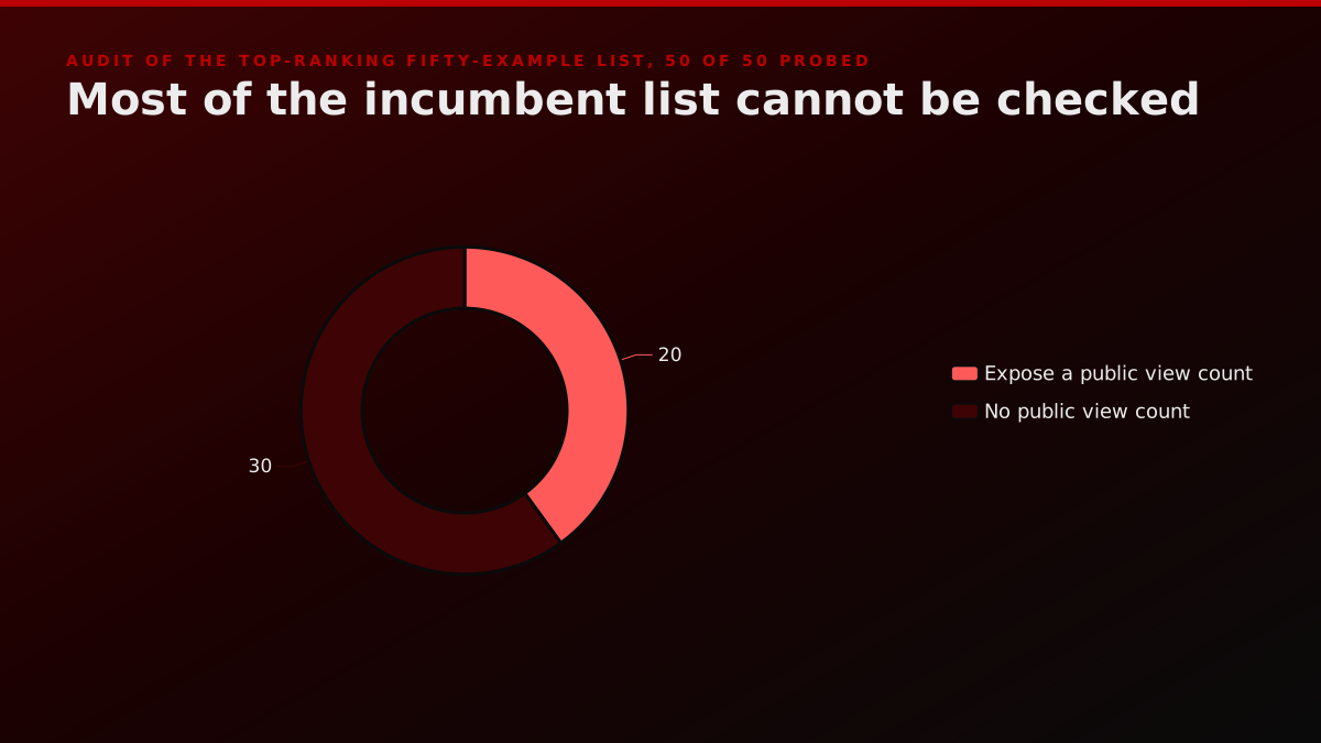
Operator noteSix of the fifty videos on the top-ranking list no longer play, and only twenty of the fifty expose a public view count., FORKOFF first-party audit of 50 of 50 embeds, 3 August 2026
We ran both controls in the same pass rather than trusting the number. A known-good video came back reachable, a deliberately fake YouTube id came back unreachable, and a fake Vimeo id returned a 404. Without the negative control, six unreachable and a broken probe look identical, which is the way most audits quietly go wrong.
Our own fourteen come out at fourteen of fourteen playing and fourteen of fourteen with a public count. That is not a claim to better taste, and it would be dishonest to present it as one. Public countability was a condition of entry for our list and it was not a condition for theirs. The point is that it should have been, which is the whole argument for the eighth criterion below. Our audit of startup launch video views makes the same argument on the launch side.
How did we score these explainer videos?
We already publish a house method for exactly this. Our teardown of the best product launch videos carries a section titled how did we rank these launch videos, and it ranks on hook strength, distribution mechanics and a verifiable reach number with its source attached. This page applies that same instinct to a neighbouring format, with the criteria rebuilt around what an explainer specifically has to do, which is make a stranger understand something.
Eight criteria, zero to two points each, sixteen available. Every video gets every criterion, including the ones it fails.
The eight criteria, what earns each mark
| Criterion | Scores 2 | Scores 0 |
|---|---|---|
| C1 Time to the problem | Names a problem the viewer owns inside 5s | Past 15s, or never |
| C2 Whose language the problem is in | A lived situation, no product nouns | Opens on features or the product name |
| C3 Runtime discipline | Under 90 seconds | Over 150 seconds |
| C4 One idea per frame | Single focal point at all three sampled claims | Clear at one sample or none |
| C5 Style serves the promise | Edit behaves the way the product claims to | Style fights the promise |
| C6 Real product, legible muted | Real interface before halfway and it parses silent | Neither |
| C7 Comprehensible outside the category | A non-customer restates it accurately in one line | Cannot |
| C8 Evidence it was watched | Public count on a named surface, source linked | No reachable number |
Sixteen points available. C1, C2, C3 and C8 come off a stopwatch, a transcript or the platform, so anyone can re-run them. C4 to C7 are judgement made on a watch, and we mark them as judgement.
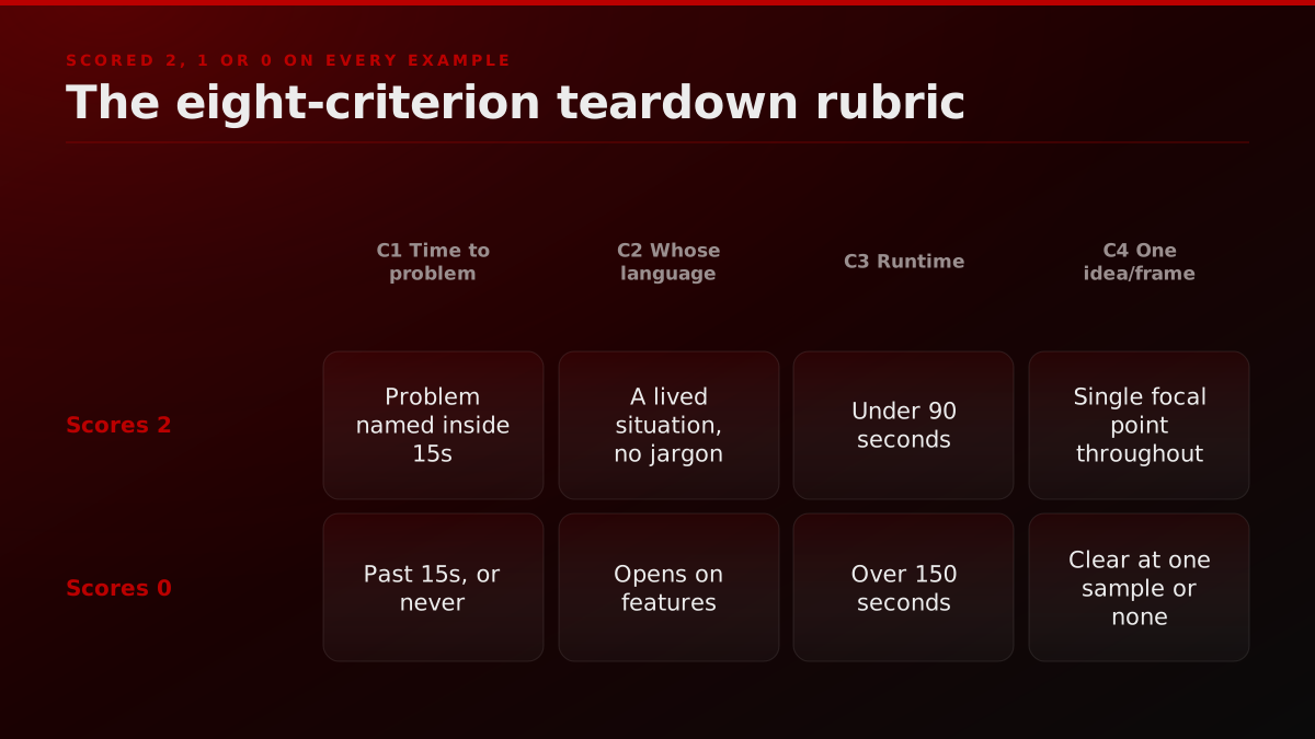
C1, time to the problem. Seconds elapsed before the video names a problem the viewer recognises as theirs. Two points under five seconds, one point from five to fifteen, zero beyond that or never. This is grounded in the field's own stated standard: PlayPlay asks for a strong hook in the first five seconds, Atlassian for a clear and focused objective.
C2, whose language the problem is in. We transcribe the opening lines and ask whether either sentence could sit unchanged on a feature page. Two points for a lived situation with no product nouns, zero for opening on features. The grounding here is the most-quoted observation in the r/MotionDesign thread that ranks first for this subject.
Best Explainer Videos LET'S MAKE A LIST
its genius wasn't the animation style (it was simple whiteboard/cutout), but the script. it didn't talk about file syncing; it talked about the relatable frustration of forgetting your usb stick. it's problem-solution narrative at its most potent.
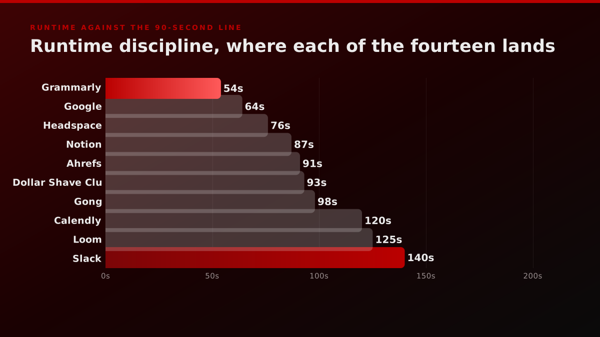
C3, runtime discipline. Two points under 90 seconds, one to 150, zero beyond. The 90-second line is not ours.
I feel like anything over 90 seconds in the explainer world is really pushing it, these days.
C4, one idea per frame. Pause at three points where the narration makes a specific claim and count competing focal elements. Two points for a single clear focus at all three. A motion designer in the same thread described the discipline as designing the animation around where the viewer's eyes should be, isolating the frame for the three seconds a claim occupies and keeping everything else quiet. The same instinct drives our launch video creative brief.
C5, style serves the promise. Name the product's core promise in one word, then ask whether the pacing, palette and music embody it or contradict it. A calm product that cuts like an energy drink advert loses this one. The cinematic versus raw demo comparison covers where each register earns its place.
C6, real product, legible muted. Does real interface appear before the halfway mark, and does the video still parse with the sound off. Two points for both, one for either.
C7, comprehensible outside the category. Can somebody who is not the target customer restate what this does in one sentence after one watch. The strongest evidence for this criterion in the whole research pass came from a commenter describing showing The Crisis of Credit to family members who speak English as a second language.
People who are ESL are always gaslighting themselves about not being smart enough to comprehend when they feel lost in the second language, but this video did not do that to my family members, and it's a complex topic.
C8, evidence it was watched. Is there a public, reachable view count, on a named surface, with a source. Two points for a public count on the owner's own channel, one for a number that exists only secondhand, zero for no reachable number. This one is ours, not borrowed from a practitioner, and we say so plainly because laundering it through somebody else's quote would be exactly the kind of move this page argues against. It is also the criterion no incumbent list applies, and the reason a distribution auditor has any business publishing a video list at all. The startup launch video distribution gap is the long version of why.
What we deliberately refuse to score
Animation craft. It is the most obvious criterion and we have no standing to use it. Grading whether one studio's character rigging beats another's is a peer judgement, and our peers are not animation studios. Every criterion above is about whether a message arrived and whether anyone received it, which is a different question from whether a frame is beautiful. Several videos on this list are more beautifully made than their scores suggest, and we say so in the entries rather than quietly awarding points for it.
We also dropped three candidate criteria. Non-AI voiceover, because you cannot reliably determine it by watching and a wrong call publicly accuses a studio of something. Narrative arc completeness, because it collapses into C2 and C7. Call-to-action quality, because it is judged against a conversion goal nobody outside the company can observe.
Which explainer video examples score best, and why?
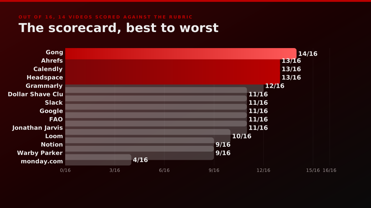
Fourteen videos, every one verified public on the day of writing, every one scored on all eight criteria. They are ordered by total score rather than by fame, which is why the household names sit in the middle. Each entry prints its per-criterion marks, the transcribed opening line with a timestamp where that decides the score, and the public view count read on 3 August 2026.
The fourteen, scored out of sixteen
| Video | Runtime | Public views | Score |
|---|---|---|---|
| Gong, Product Overview | 98s | 63,796 | 14 |
| Ahrefs, What is Ahrefs? | 91s | 94,741 | 13 |
| Calendly, What is Calendly? | 120s | 36,335 | 13 |
| Headspace, How It Works | 76s | 370,635 | 13 |
| Grammarly, How Does Grammarly Work? | 54s | 26,693,999 | 12 |
| Dollar Shave Club, Our Blades Are Great | 93s | 28,996,016 | 11 |
| Slack, So Yeah, We Tried Slack | 140s | 1,462,390 | 11 |
| Google, What is Gemini Omni? | 64s | 49,388,776 | 11 |
| FAO, Let's talk about soil | 324s | 220,748 | 11 |
| Jonathan Jarvis, The Crisis of Credit | 670s | 3,213,043 | 11 |
| Loom, What is Loom? | 125s | 101,617 | 10 |
| Notion, What is Notion? | 87s | 86,831 | 9 |
| Warby Parker, How Glasses Are Made | 156s | 118,362 | 9 |
| monday.com, Everything you can do | 362s | 1,098,979 | 4 |
View counts read on 3 August 2026 and they move. Runtimes do not. Mean 10.9 of 16, high 14, low 4, nothing reached 16. Ordering by score and ordering by views disagree almost completely.
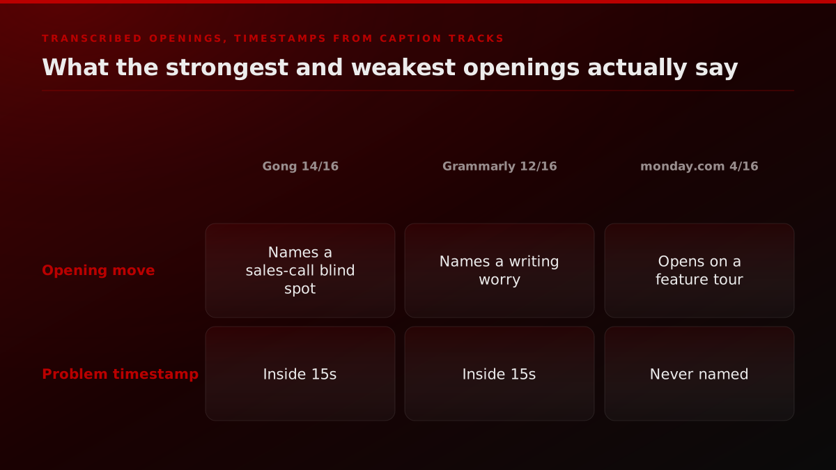
1. Gong, Product Overview. 14 of 16
C1 2, C2 2, C3 1, C4 2, C5 2, C6 2, C7 1, C8 2. 98 seconds, 63,796 public views.
It opens at 0.6 seconds with a question rather than a statement: are you totally dependent on your CRM to run your business. There is no product noun anywhere in the first twenty-two seconds, only a described situation and its consequence, that today's platforms show what already happened without showing how you got there, leaving your most important questions unanswered. The product name arrives at 24.4 seconds, after the problem has been fully built. That sequencing is why it tops the table.
It drops a point on runtime at 98 seconds and a point on C7, because a viewer outside sales operations can follow the words and still not be able to say in one line what the software does. Revenue intelligence is a category term, and category terms are the last place comprehension goes to die.
2. Ahrefs, What is Ahrefs? 13 of 16
C1 2, C2 2, C3 1, C4 2, C5 1, C6 1, C7 2, C8 2. 91 seconds, 94,741 public views.
The cleanest opening in the set, and it is not close. The first four words at 0.2 seconds are here's the problem, followed by thirty-one seconds of pure situation: you invested time and money in a great website, nobody is coming to it, they cannot find you, they are finding your competitors instead, and the beautiful thing you built is getting no traffic. No product noun until 33.8 seconds.
What is Ahrefs?
Ahrefs
The cleanest opening in the set. The first four words are "here's the problem", spoken at 0.2 seconds, and no product noun appears for 33 seconds.
The runtime is the joke of the whole exercise. 91 seconds. One second past the practitioner's line, which costs it a point under a rule we published before we measured anything. We left it at one point, because a rubric you bend by a second for a video you like is not a rubric.
C5 and C6 both take one point. The animation style is the generic explainer register that would fit any software company, and the interface arrives late and does not carry the argument without narration.
3. Calendly, What is Calendly? 13 of 16
C1 2, C2 1, C3 1, C4 2, C5 1, C6 2, C7 2, C8 2. 120 seconds, 36,335 public views.
The problem lands at 2.2 seconds with a number attached: research showing it takes an average of seven emails back and forth to schedule one meeting, then the no-shows, the group meetings, the time zone math. That is a person's actual week. It only takes one point on C2 because the very first words at 0.0 seconds are welcome to Calendly, so the product name beats the problem to the microphone by two seconds.
C5 takes a point off for a reason worth naming: the promise is easy and fast, and the video is two minutes long. A product whose entire pitch is that it saves you time is a strange thing to explain slowly.
At 36,335 views it is the least-watched video on this list and the third-highest scoring. Hold that thought.
4. Headspace, How It Works. 13 of 16
C1 1, C2 1, C3 2, C4 2, C5 2, C6 1, C7 2, C8 2. 76 seconds, 370,635 public views.
The best example on the list of style doing real argumentative work. The promise is a calmer mind, and the edit is soft, slow and minimal, with the pacing set by the music rather than by the cut. It never gets excited about itself. A practitioner in the research thread singled it out as aesthetics serving the product's function, and the score agrees: full marks on C5 and on focus.
It loses on the opening. At 0.4 seconds it says meditation has been shown to reduce stress, to improve focus and create the right conditions for healthy restful sleep. Those are outcomes, not a problem. Nobody in the video is stressed, tired or unfocused. Naming the remedy is not the same as naming the ache, and one point is what that difference costs.
5. Grammarly, How Does Grammarly Work? 12 of 16
C1 0, C2 0, C3 2, C4 2, C5 2, C6 2, C7 2, C8 2. 54 seconds, 26,693,999 public views.
Six criteria at full marks and two at zero, which makes this the most instructive row in the table. It is 54 seconds, the shortest in the set. It is beautifully focused, one suggestion highlighted at a time. The interface carries the entire argument and the video parses perfectly with the sound off. Anyone can restate what it does.
And it opens like this, at 0.4 seconds: you might be wondering, how does Grammarly work, the answer lies in complex, cutting-edge algorithms developed over years of research by some of the world's leading computational linguists. That is the machinery, described by the people who built it, and no viewer problem appears anywhere in the runtime. Zero on C1 and zero on C2.
It has 26.7 million views. We will come back to that.
6. Dollar Shave Club, Our Blades Are F***ing Great. 11 of 16
C1 0, C2 1, C3 1, C4 2, C5 2, C6 1, C7 2, C8 2. 93 seconds, 28,996,016 public views.
The single most-cited example in this entire category, and it is mid-table. The style work is faultless: the promise is cheap, direct and unfussy, and the film, published in March 2012, is handheld, deadpan and shot in a warehouse, so the edit and the claim say the same thing. Full marks on C4 and C5.
The opening is a product description. Hi, I'm Mike, founder of dollarshaveclub.com, for a dollar a month we send high-quality razors right to your door. The viewer's actual problem, that you are paying twenty dollars a month for brand-name razors and nineteen of it goes to Roger Federer, does not arrive until 25.4 seconds. It is the best line in the video and it is a third of the way in. Zero on C1.
C6 takes one point because the video is verbal comedy end to end. Muted, it is a man walking through a warehouse. Our anatomy of a 1M-view launch video covers what carried it beyond the film itself.
7. Slack, So Yeah, We Tried Slack. 11 of 16
C1 0, C2 1, C3 1, C4 2, C5 2, C6 1, C7 2, C8 2. 140 seconds, 1,462,390 public views.
A genuinely good piece of film-making that a rubric is unkind to, and the unkindness is the point. It opens on the narrator's own meta-story at 1.6 seconds, six months ago I get an email from Stewart Butterfield, and the recognisable problem does not land until 20.3 seconds, when he describes emailing one colleague, texting another and Gchatting a third. That is the moment the viewer nods, and it is twenty seconds in.
Full marks on style: it is warm, dry and self-deprecating for a product whose promise is that work can be less awful. At 140 seconds it takes the middle mark on runtime, and muted it is people talking.
8. Google, What is Gemini Omni? 11 of 16
C1 0, C2 0, C3 2, C4 1, C5 2, C6 2, C7 2, C8 2. 64 seconds, 49,388,776 public views.
The most-watched video on this list by a distance, and a double zero on the opening. First words at 0.0 seconds: nano banana for video is here, it's called Gemini Omni, I'm Sammy and I work on the Gemini Omni team. An internal codename, a product name and a staff introduction, before any human being has been given a reason to care. No problem is named at any point in the runtime.
Everything after that is strong. It parses completely muted because the demonstration is visual by nature, the style genuinely embodies the promise since a video about transforming video transforms video in front of you, and a non-customer can restate it in one line. C4 takes a point off for pace: the transformations arrive faster than the eye can settle on any of them.
49.4 million views with nothing resembling a problem statement. Some of that is the product being interesting. Most of it is the distribution behind the largest channel in the category.
9. FAO, Let's talk about soil. 11 of 16
C1 2, C2 2, C3 0, C4 1, C5 2, C6 0, C7 2, C8 2. 324 seconds, 220,748 public views.
Not a product video at all, and it beats most of the product videos on the criteria that are about communication. It opens at 3.7 seconds with we overlook it, we walk all over it, trample it every day, yet we need it like the air we breathe. That is a lived situation in the viewer's own language with no product noun in sight, and it is full marks on both of the criteria where the software companies collapse.
Then the rubric takes it apart on the product criteria. 324 seconds is zero on runtime. There is no interface to show and it does not parse muted, because the narration carries everything, so C6 is a zero. Two of the eight criteria are structurally unavailable to a public-information film, and we left the zeros in rather than quietly exempting it. A rubric with exemptions for the videos you admire is not a rubric.
10. Jonathan Jarvis, The Crisis of Credit Visualized. 11 of 16
C1 1, C2 2, C3 0, C4 2, C5 2, C6 1, C7 2, C8 1. 670 seconds, 3,213,043 public views.
The piece more than one practitioner named as the work that started the modern explainer, and the rubric gives it eleven. Eleven minutes is a zero on runtime and there is no arguing it back. What it earns everywhere else is real: it is a masterclass in one idea per frame, it names the problem in the viewer's own vocabulary at 10.9 seconds by listing the terms you have probably heard and admitting nobody understands them, and its comprehension case is the strongest documented on this page.
It is the only video here to score one on C8 rather than two. Its 3.2 million views sit on a third-party reupload, not on the creator's own channel, and the creator's canonical copy carries no public count at all. The most influential explainer ever made has no authoritative public number, which is a small illustration of the thirty-of-fifty problem.
11. Loom, What is Loom? 10 of 16
C1 1, C2 1, C3 1, C4 1, C5 1, C6 1, C7 2, C8 2. 125 seconds, 101,617 public views.
Almost every criterion at exactly one point, which is its own kind of diagnosis. The framing is right: at 8.2 seconds somebody asks why don't you replace some of those meetings with a Loom, and too many meetings is a real, felt problem. Then it becomes a two-minute comedy sketch set in the office of the future.
C5 is where the tension shows. The promise is that you can stop spending time in meetings, and the explanation of that promise takes 125 seconds of elaborate staging. The sketch is doing work the product's own argument does not need. C4 and C6 both take one point for the same reason: there is a lot happening in frame and the humour is carried by dialogue, so muted it loses most of itself.
12. Notion, What is Notion? 9 of 16
C1 0, C2 0, C3 2, C4 1, C5 1, C6 2, C7 1, C8 2. 87 seconds, 86,831 public views.
It opens by defining itself against other categories. It's not an AI chatbot, it's not a task tracker, it's definitely not a note-taking app, Notion is a better way to work with all your team's knowledge, projects and AI in one place. That is positioning, delivered to an audience that has not yet been given a reason to want any of it. Zero on the first two criteria.
C7 takes the unusual step of scoring one rather than two, because a better way to work is not a description of a function. A non-customer finishes this video able to repeat the phrase and not able to say what the software does. The runtime is disciplined at 87 seconds and the interface is everywhere and legible, so it banks those points cleanly.
13. Warby Parker, How Warby Parker Glasses Are Made. 9 of 16
C1 0, C2 0, C3 0, C4 2, C5 2, C6 1, C7 2, C8 2. 156 seconds, 118,362 public views.
This sits on the top-ranking studio list as an explainer video example. It is a beautifully shot factory film and it is not an explainer, which is precisely the kind of thing a rubric catches and a description does not.
The first speech arrives at 12.6 seconds and it is corporate strategy: by circumventing traditional channels, designing glasses in-house and engaging with customers directly, we're able to offer premium eyewear at a fraction of the going price. No viewer problem is ever named. It scores full marks on the focus and style criteria, because it is patient, tactile and single-subject in every shot, and its style matches its promise of careful making at a fair price exactly.
Nothing here says it is a bad video. It says it is a bad answer to the question the reader asked, and a list that only describes cannot tell you that.
14. monday.com, Everything you can do with monday.com. 4 of 16
C1 0, C2 0, C3 0, C4 0, C5 0, C6 1, C7 1, C8 2. 362 seconds, 1,098,979 public views.
The lowest score on the list, and it has over a million views.
It opens at 0.0 seconds with hey everyone, in this video we're going to see how you and your team can manage all your projects and processes with monday.com, more than a hundred thousand companies use monday.com. Product name, feature list, social proof, in the first ten seconds, and no problem at any point in six minutes.
Everything you can do with monday.com
monday.com
The lowest score on the list at 4 out of 16, and 1,098,979 public views. Six minutes, opens on the product and a customer-count statistic, and never names a problem.
C4 and C5 are the only zeros for those criteria in the entire set. The frames are dense multi-column boards with several things competing at every moment, and the promise is that work becomes simple while the video is a six-minute tour of configuration. It banks its points on having a real interface on screen and a reachable public count.
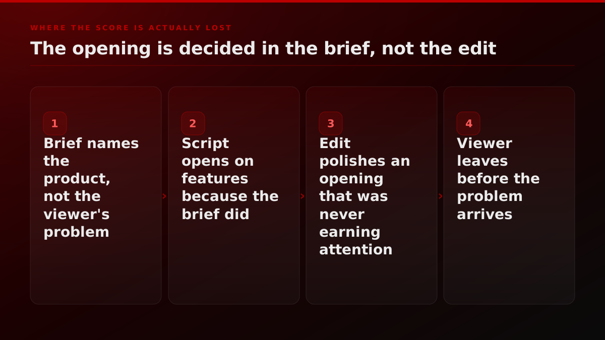
It is not a bad video. It is a good tutorial filed under the wrong job, which is a failure of brief rather than of production, and it is the most common failure we see. The launch video readiness checklist catches this one before a camera is booked.
What do the scores actually show about explainer videos?
Three things, and only the first of them was expected going in. The set is made well and begins badly, the runtimes have drifted past the standard the field states for itself, and the score a video earns has almost nothing to do with how many people watched it. Each of those is visible in the per-criterion averages rather than in any single entry.
The failure is in the opening, not in the craft. Averaged across the fourteen, time to the problem scored 0.79 out of 2 and viewer language scored 0.93. Those are the two lowest of the eight. Focus and style discipline both averaged 1.57, comprehension outside the category averaged 1.79, and reachable evidence averaged 1.93. The videos are made well. They begin badly.
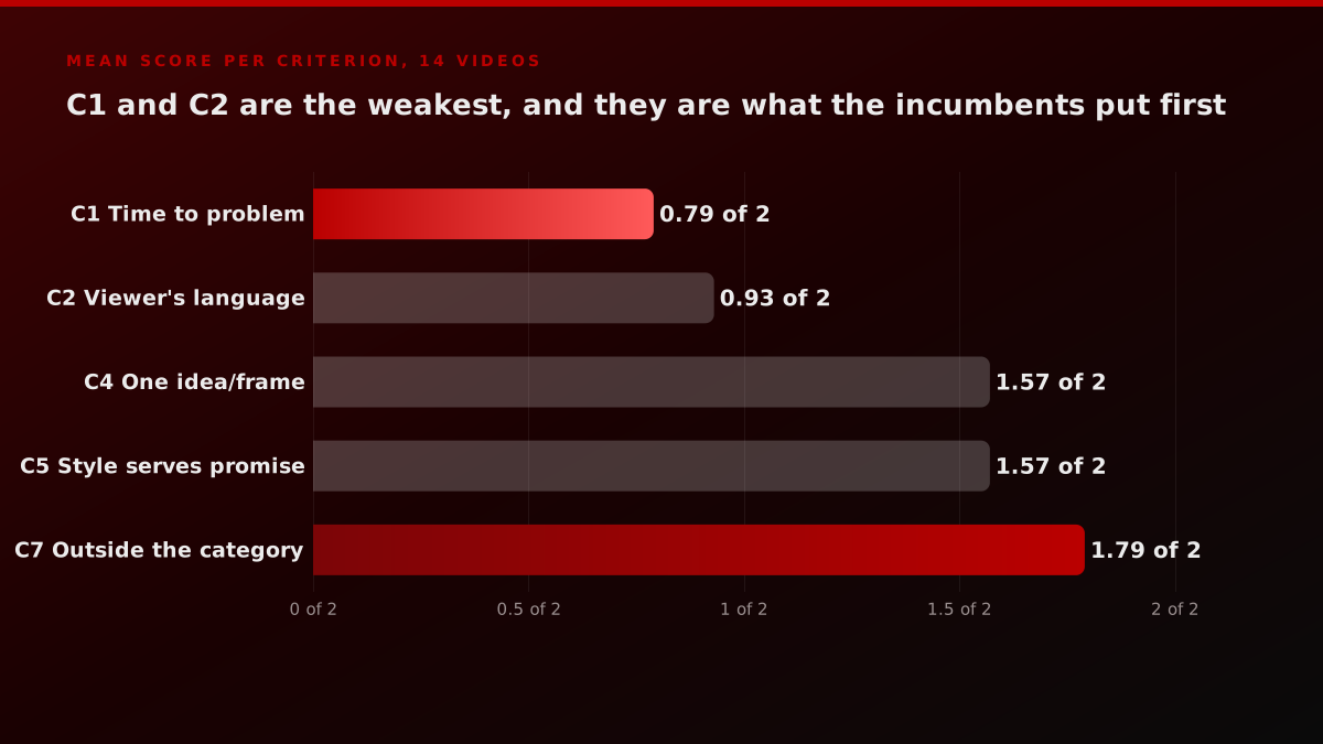
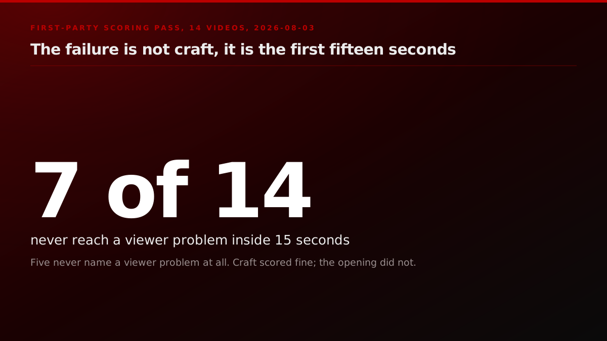
Seven of fourteen score zero on the first criterion. Five of them never name a viewer problem at any point in the runtime: Grammarly, Google, Notion, monday.com and Warby Parker. Between them those five have 77,386,947 public views, which tells you the market does not punish this directly, and that a video can be watched enormously while doing the explaining job poorly.
Runtime has drifted past the standard the field states for itself. The median came to 109 seconds. Only four of fourteen cleared the 90-second line that a twenty-year practitioner called the outer edge of reasonable. Four ran past 150 seconds. Worth saying plainly that the two large public corpora are looser than the practitioners here rather than stricter: Wistia's optimal video length analysis puts awareness and social content under a single minute but gives explainers a one to five minute band, and Vidyard's business video benchmarks find 65 percent of viewers finish a video under a minute against 20 percent for one running past twenty, with engagement falling at every runtime milestone in between. So the platform data says shorter is better without drawing a hard line, and the people who make these for a living draw it at 90. There is a reason this is systematic rather than random: the person approving the cut has used the product for years and cannot feel the second minute the way a stranger does.
The platform data is looser than the practitioners are
Wistia works from a corpus of more than 13 million videos and maps recommended length directly to the job a video is doing. It puts awareness and social content under a single minute, and it puts explainers, product overviews and feature walkthroughs in a one to five minute band, which is materially more permissive than the 90-second line the practitioners hold. Our fourteen came in at a median of 109 seconds, with only four of the fourteen under 90. So the drift is not away from the platform data, it is away from the people who make these for a living, and it drifts for a predictable reason: the person approving the cut knows the product too well to feel the second minute.
Source: Wistia, How to Choose the Right Marketing Video Length for Any Goal
The 90-second ceiling also turns up from a completely independent direction. A founder posting a production walkthrough in r/SaaS, with no connection to the motion design world, lands on the same number without being prompted.
How to create a cool demo video for your SaaS: a step-by-step guide
It should clearly showcase what you do in under 1 minute and 30 seconds, ideally not exceeding 30 seconds. You'll invest about 3 hours of work without needing any specific expertise.
Nothing scored full marks. The top of the table is a 14, from a video with 63,796 views that most people reading this have never seen. That is not a flaw in the rubric. It is what a rubric is supposed to do.
Does a higher-scoring explainer video get more views?
No, and this is the finding we would have been happiest to bury, because it undercuts the easiest thing a video page can sell. Rank the fourteen by public view count, split them into quartiles, and the relationship between how well a video is built and how widely it travelled turns out to run slightly backwards on this sample.
Take the four most-watched. Google at 49.4 million, Dollar Shave Club at 29.0 million, Grammarly at 26.7 million, The Crisis of Credit at 3.2 million. Their scores are 11, 11, 12 and 11, an average of 11.25.
Now take the four least-watched. Calendly at 36,335, Gong at 63,796, Notion at 86,831, Ahrefs at 94,741. Their scores are 13, 14, 9 and 13, an average of 12.25.
The least-watched quartile outscores the most-watched quartile.
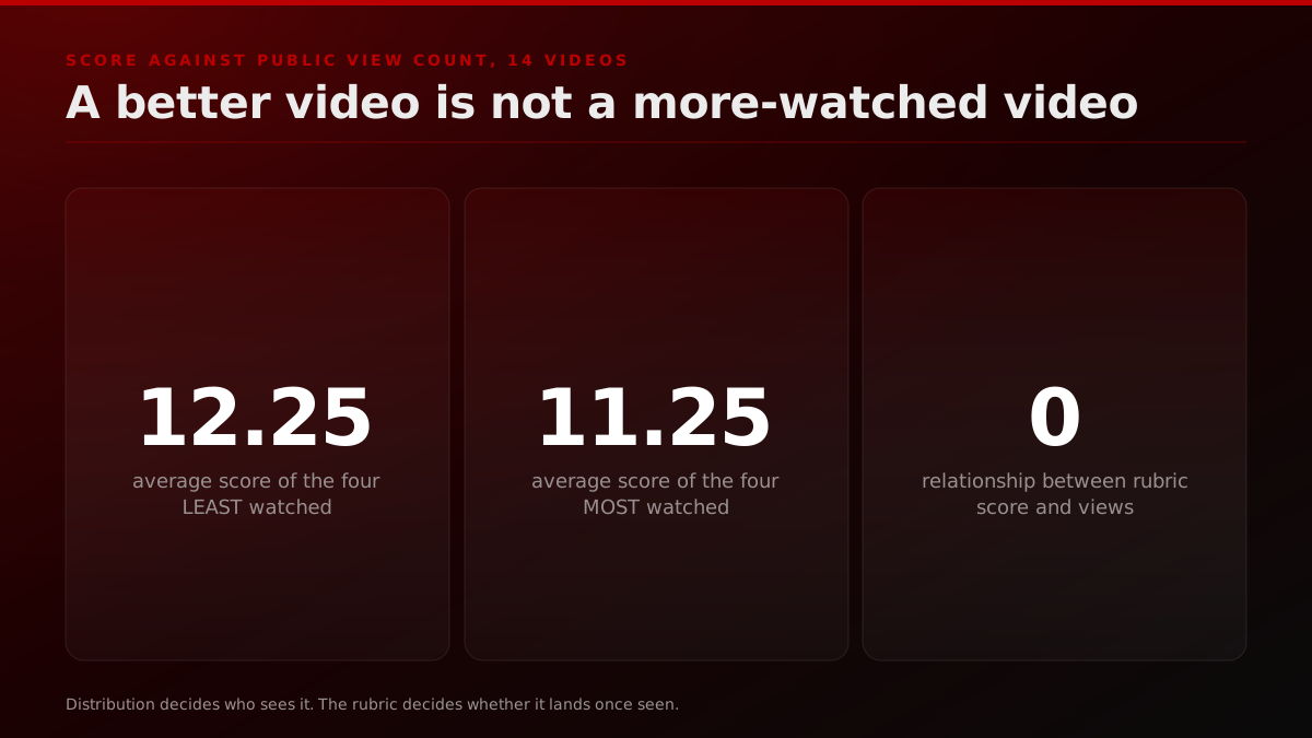
Operator noteThe four least-watched videos in the set outscored the four most-watched. The film is not the distribution, and this set says so out loud., FORKOFF scoring pass, 3 August 2026
We are not going to over-read fourteen data points into a law. What it does establish, on this set, is that the qualities a film controls and the reach a film achieves are close to independent, and anyone selling you the idea that a better video is a more-watched video is describing a relationship this sample does not contain.
The mechanism is not mysterious. Google's 49 million did not come from its opening fifteen seconds, it came from being Google. Dollar Shave Club's 29 million came from a founder-led launch moment that has been studied ever since. Gong's 63,796 came from being a well-made asset on a company channel with no distribution behind it, which is the normal condition of a normal explainer video.
That split is the reason this page exists on a distribution company's blog rather than a studio's. The script decides whether the message lands on the people who arrive. Distribution decides how many arrive. Our 2026 launch video playbook works the second half in detail, the teaser, trailer and sizzle format breakdown covers which cut to reach for when an explainer is the wrong tool, and the guide to getting 100k views on a launch video is the mechanical version of the same argument.
Sudip
@sudiprokaya
Introducing Simi, the fastest way to make an explainer video. It works like ChatGPT, except the answer is a video. Give it a prompt, document, or script. In under a minute, Simi turns it into an explainer designed to teach, not just look good.
There is a timing argument underneath all of this too. Producing a competent explainer has collapsed to a prompt. When a document becomes a finished animated video in under a minute, the craft half stops being scarce, and the two things left are the ones this rubric measures hardest: whether the first fifteen seconds name a real problem, and whether anyone ever sees the file. Our short-form video guide for startups covers what that shift does to the feed side.
What should you steal from these explainer videos?
Five things, all of which live in the script and the edit rather than in the budget, and all of which are visible in the gap between the top and the bottom of the table. None of them requires a bigger production, a different studio or a longer runtime. Four of the five are decisions made before anyone opens an editor, which is also why they are the cheapest defects in this whole set to fix.
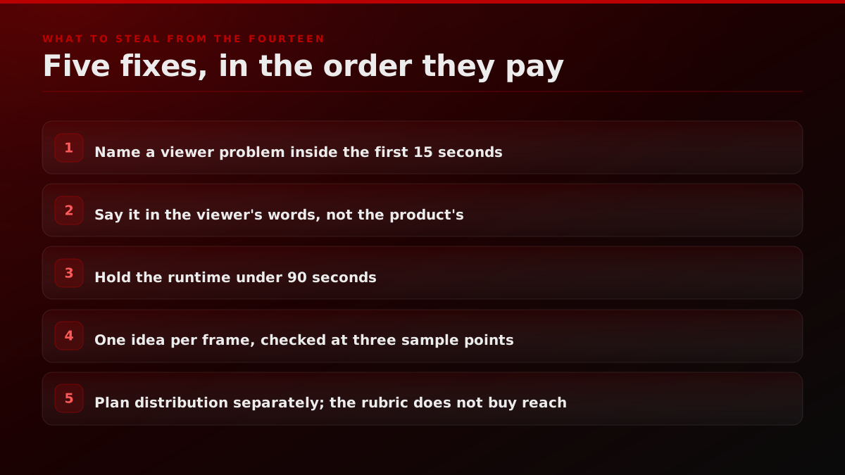
Open on the ache, not the remedy. Ahrefs says here's the problem in the first second and spends thirty-one seconds on your situation before naming itself. Gong opens on a question its buyer has already asked in private. Compare either with an opening that names the product, the category or the founder, and the difference costs you nothing to copy.
Write the first two sentences, then test them against your own feature page. If either sentence could sit on that page unchanged, it is the product's language and not the viewer's. This is C2 as a five-minute exercise, and five of our fourteen would fail it.
Set a hard runtime before you write, not after you edit. Under 90 seconds. The four videos in our set that cleared that line did not do it by cutting a finished piece down, they did it by having less to say in the first place. Our launch week video sequencing guide covers how to split what will not fit rather than stretching one cut.
Watch your own cut with the sound off, once, before you approve it. Grammarly survives that test completely and Loom does not. Whether the argument is carried by the frame or by the narration is a decision, and most teams make it without noticing.
Decide who is going to watch it before you decide what it looks like. Gong scored highest in this set and has 63,796 views. That is a distribution outcome, not a film outcome, and it was settled by choices made nowhere near the edit suite. Pairing the two halves is the whole premise of our product launch video service, which is priced on the outcome rather than on the production. If you want the cost side of that decision, we broke it out in what a launch video costs, which covers explainer pricing alongside the other formats, and the teaser as a launch asset covers the format that fails hardest when nobody is waiting.
The verdict
The reason every list of explainer video examples reads the same is that describing is cheap and grading is not. Grading forces you to publish a mark you might have to defend, on a video the whole industry admires, and every incumbent has quietly declined that. So a reader gets fifty titles, or twelve descriptions, or twenty-five animation styles, and no way to tell which of them answers their question.
Our answer, on our own eight criteria, is that Gong's product overview is the best explainer video on this list at 14 out of 16, and that its 63,796 views say nothing whatsoever about that. The most famous examples land mid-table. The most-watched are among the weakest openers in the set. Half the list never gets round to naming a problem.
If you take one thing from the scorecard, make it the first row. Time to the problem is the cheapest criterion to fix, it is the one the whole field says matters most, and it is the one seven of these fourteen failed outright.
Operator noteSeven of our fourteen never reach a viewer problem inside fifteen seconds. Five never name one at all., FORKOFF scoring pass, transcripts and timestamps published