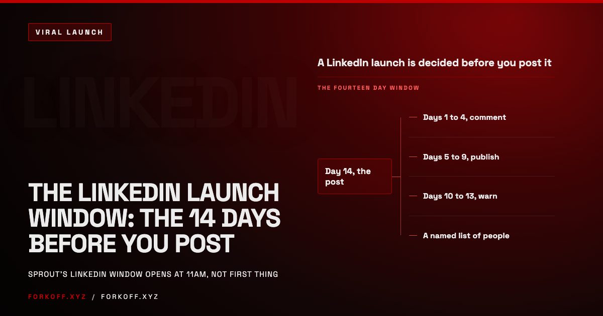

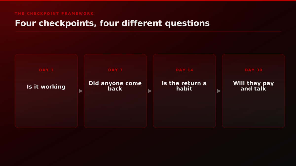
Most teams watch the wrong number for the first three weeks of a launch, then panic when it drops. The number is total signups, and it drops because launch-day traffic was never going to stick around. Track four checkpoints instead. Day 1 tells you whether the product is functionally working. Day 7 tells you whether anyone came back. Day 14 tells you whether that return is becoming a habit. Day 30 tells you whether people will pay and talk about it. None of those four questions gets answered by a running total of signups, and that mismatch is why so many launches feel like they are dying in week three when the product is actually fine. The same logic applies before launch day: what you can measure on Day 1 is largely set by the audience you warmed in advance, which is what the LinkedIn launch window covers.
The short version
Launch-day signups are the worst quality traffic a product ever gets, so tracking them past Day 1 manufactures a false decline that has nothing to do with whether the product works. Track four checkpoints instead. Day 1 is functional health and signup completion. Day 7 is activation rate and time to value, where the current cross-category median sits at 8 percent Day-7 retention and a strong performer clears 10 to 15 percent (UXCam, 2026). Day 14 is week-2 retention, the single number that most reliably predicts trajectory: above 20 percent and the product is probably real, below 10 percent and it is not solving a problem yet. Day 30 is revenue per sales conversation and unprompted external mentions. Total signups, website traffic, and follower counts tell you nothing about whether you have a business, and the earlier you stop watching them, the sooner the real signal shows up.
Why do launch-day numbers lie to you?
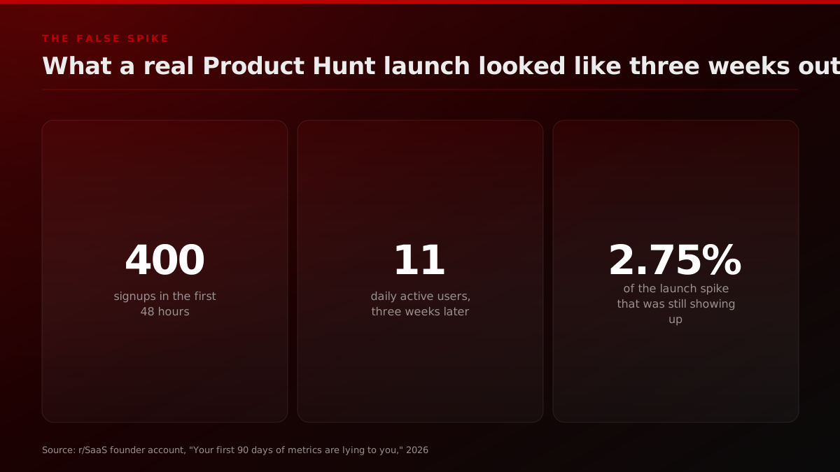
A founder posting on r/SaaS described the pattern plainly. They launched on Product Hunt, got 400 signups in 48 hours, and genuinely believed the product had found its audience. Three weeks later, daily active users sat at 11. Not 11 percent. 11 people, out of 400 signups. Most of the original spike was other founders signing up to be supportive, never to return.
Your first 90 days of metrics are lying to you, here's what actually matters
Every SaaS I've launched or advised has the same pattern. You launch, get a spike of signups, feel amazing for about two weeks, then stare at a dashboard wondering what went wrong. At my last company we launched on Product Hunt, got 400 signups in 48 hours. Three weeks later… Show more
That is not a failure specific to one product. It is what launch traffic is, structurally. A Product Hunt spike, a press mention, a viral tweet, all of them are curiosity clicks, not buying intent. The problem is not that the traffic arrives, it is that teams keep watching the signup counter after the spike instead of switching to a different instrument. If your baseline expectation is set by the spike, every week after reads as decline even while the product is working exactly as intended for the small group of people who actually needed it.
The same founder's account puts a finer point on where those 400 signups actually came from: mostly other founders, signing up out of solidarity rather than need, the exact audience a launch-day surge over-indexes on and the exact audience least likely to become a real user. That is worth sitting with, because it means the composition of a launch-day cohort is often structurally different from the composition of the cohort you will actually sell to in month two. Measuring the health of the business against the wrong cohort is not just noisy, it is measuring the wrong population entirely, which is a mistake no amount of additional signups will fix.
The 30-second rule: launch-day signups measure curiosity, not fit. Everything that matters happens after the counter stops climbing.
The uncomfortable part of that framing is how good the spike feels while it lasts. A founder update written on launch day, with the signup counter still climbing, is genuinely one of the best moments in a company's life, and there is no reason to pretend otherwise. The problem only starts on day three or four, when the same counter is used to project forward, "if we got 400 in two days, we will have 4,000 by the end of the month," a projection built entirely on a number that was never going to behave linearly in the first place. Curiosity clicks front-load. Real usage does not.
That front-loading is also why so many teams describe the same emotional arc after a launch: euphoria on day one, quiet confusion by day five, and a kind of low-grade dread by day ten that something is wrong, without being able to point to what changed. Nothing changed. The spike simply finished doing what spikes do, and the team had not yet switched to measuring the thing that was actually going to determine the outcome.
The scale of the mismatch is easy to underestimate. A 2026 review of Product Hunt launch conversion data puts realistic visitor-to-signup conversion at 1 to 3 percent for most non-optimized launches, well under the 5 to 10 percent figure older playbooks still quote, and one cited study found Product Hunt converting at roughly 3.1 percent per launch against a community platform like Indie Hackers converting closer to 23 percent. A spring 2026 founder cohort tracked by Causo makes the same point from a different angle: seven-day signups attributable to the launch ranged from 71 to roughly 450 across four founders, a median around 115, and paid conversion so far ranged from 0 to about 20 percent with three of the four sitting at or below 4 percent. Rank on launch day did not predict revenue. The highest-ranked launch in that cohort reported the lowest conversion rate of the group.
What are the four checkpoints that actually predict whether you have a business?
The fix is not a better dashboard with more numbers on it. It is fewer numbers, asked at the right moment. Four checkpoints cover the full arc from launch to the point where a product either has real pull or does not.
How many metrics to add at each launch checkpoint
Cumulative count of the metrics this post recommends tracking by each checkpoint, not a measured external dataset. Illustration of the framework below, not a benchmark.
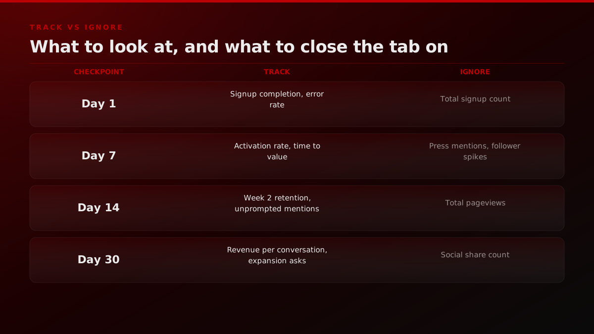
Day 1 asks whether the thing works. Day 7 asks whether the first cohort found enough value to open the product again on their own. Day 14 asks whether that return is becoming a pattern instead of a one-off. Day 30 asks the question that actually pays the bills, whether people will hand over money and tell someone else about it. Each checkpoint builds on the one before it. A product that fails Day 7 will never get a meaningful Day 30 answer, because there is no cohort left to measure.
The four launch checkpoints, at a glance
| Checkpoint | Core question | What to track | What to ignore |
|---|---|---|---|
| Day 1 | Is it functionally working | Signup completion rate, error rate, page load time | Total signup count on its own |
| Day 7 | Did anyone come back | Activation rate, time to value | Press mentions, follower count |
| Day 14 | Is the return a habit | Week 2 retention, unprompted mentions | Total pageviews |
| Day 30 | Will they pay and talk | Revenue per sales conversation, expansion requests | Social share count |
Framework synthesized from the sources cited throughout this post; see the Sources section for the underlying data.
Day 1: functional health, not vanity signups
The first 24 hours are not about growth. They are about whether the thing you shipped actually behaves the way it should under real traffic, from real devices, on a real network. The two numbers worth watching are signup completion rate (the share of people who start a signup and finish it) and functional error rate (500s, failed payments, broken onboarding steps). Total signup count on Day 1 is close to meaningless on its own, since it is mostly a function of how much distribution you bought or borrowed for the day, not whether the product is any good.
If your signup completion rate craters mid-launch, that is a UX or infrastructure problem you can fix in hours. If it looks fine but nobody who signs up ever comes back, that is a product problem, and you will not see it until Day 7. Conflating the two is the single most common Day 1 mistake: teams either panic over a normal signup number, or celebrate a big one that is about to evaporate.
Functional error rate deserves more attention than most launch checklists give it, because launch-day traffic is disproportionately likely to hit edge cases a beta cohort never found. New signups on unfamiliar devices, unusual network conditions, and payment methods that were never tested at volume all show up on day one in a way they simply do not during a slow, controlled beta. A spike in checkout failures or broken onboarding steps on launch day is not noise to be smoothed over in a retrospective. It is actively costing you activation-eligible users in real time, and it is the one Day 1 problem that is both fully within your control and fully reversible if caught within the first few hours rather than the first few days.
Day 7: activation rate and time to value
By the end of the first week, the question changes from "did it work" to "did anyone find value." The two metrics that answer this are activation rate (the share of signups who complete a specific, named first-value action, not just create an account) and time to value (how long it takes from signup to that moment).
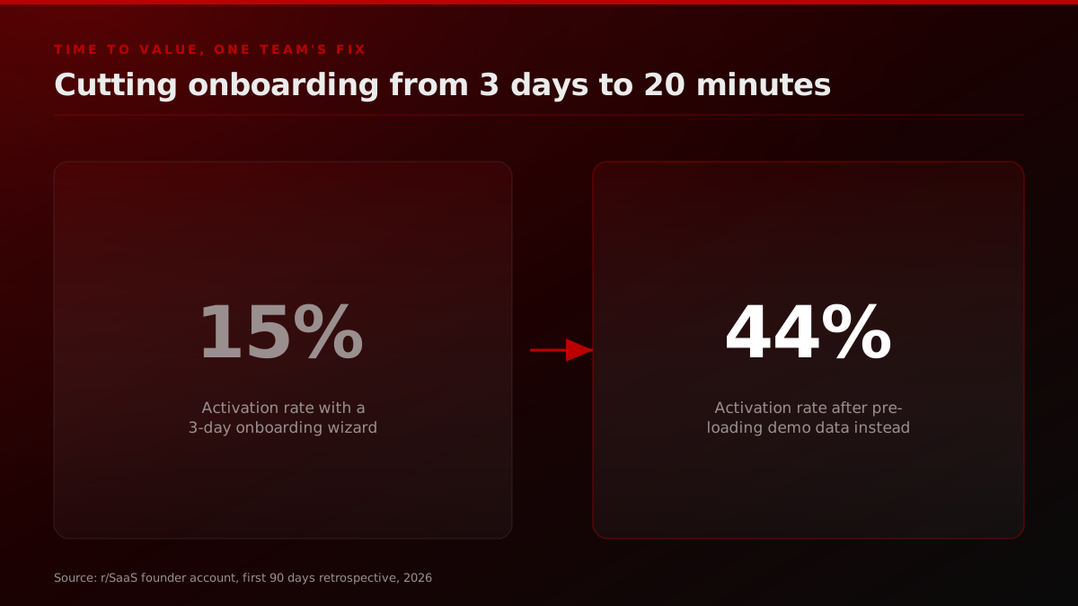
One founder's account, also posted on r/SaaS, is a clean example of how much time to value moves activation. At one company, cutting onboarding from a 3-day guided wizard down to 20 minutes, by killing the wizard and pre-loading demo data instead, took activation rate from 15 percent to 44 percent. Nearly three times the activated users, from the same signup pool, with no change to the core product. The lever was entirely about how fast a new user reached the moment the product proved its value.
On the retention side of Day 7, a builder launching a social app publicly tracked Day 7 retention on launch day itself, treating it as the number that would decide whether the beta's promise held up post-launch. That instinct is correct. Day 7 retention is the earliest point where a real behavioral signal, not a vanity one, becomes measurable.
alva
filipealva
launching today! if the retention remain as good as during the beta post launch it will be incredible, not a week below 50% on Day 7 retention
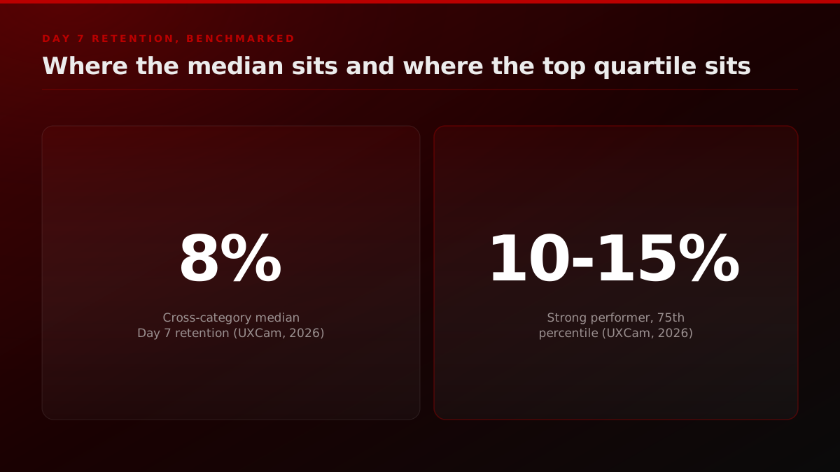
Cross-category benchmark data from UXCam puts the median Day 7 retention at 8 percent, with a strong performer clearing 10 to 15 percent. SaaS and productivity products tend toward the higher end of that band, because the product gets embedded into a daily or weekly workflow faster than a consumer app typically does. If your Day 7 number sits meaningfully under 5 percent, that is a signal to fix activation before spending another dollar on acquisition, not a signal to run a bigger launch next time.
Phiture's retention benchmark guide frames the same data by category and finds SaaS products are typically expected to clear 40 percent Day 30 retention to be called good, well above the cross-category median, precisely because a paid workflow tool earns habitual use in a way a free consumer app rarely does. Appcues' 2026 category breakdown backs the mechanism, not just the number: apps that get users to a core value action within the first session see 2 to 3 times better Day 7 retention than apps that do not, which is the exact lever the time-to-value fix above is built around.
Day 14: week-2 retention, the single most predictive number
If you only track one number after launch, make it week-2 retention: the share of people who signed up in week one and come back, unprompted, in week two. No reminder email, no push notification, just people choosing to return because the product earned it.
The r/SaaS founder cited above frames the threshold clearly: above 20 percent week-2 retention, the product usually has something real. Below 10 percent, it is not solving a problem urgently enough yet. That single number, in their account, predicted the trajectory of every product they worked on afterward, better than signups, better than early revenue, better than anything measured in the first week.
Launched Esports Oracle 1 week ago. $105 MRR. 38 Registered Users.
After 7 days: 38 registered users, $105 MRR with a checkout conversion rate of 57.14%, 170 active users total, 867 page views. Retention is the open question, cohort data shows week 1 drop off is real which is the thing I am working on now.
Esports Oracle's launch, a prediction platform for competitive League of Legends and CS2, is a useful real example of what Day 7 looks like before the week-2 answer is in. Seven days after launch, per the founder's own thread: 38 registered users, $105 in MRR, a 57.14 percent checkout conversion rate, and 170 total active users across 867 page views. The founder's own read on it was honest: retention is the open question, cohort data shows real week-1 drop-off, and one weekly subscriber had already been retained, which counted as a genuinely good early sign rather than a victory lap.
That honesty is the right posture at Day 7. The real answer does not arrive until week two closes.
It is worth naming what week-2 retention is not measuring, because the distinction matters. It is not asking whether a user liked the product, whether they told a friend about it, or whether they would recommend it if asked. It is asking only whether they came back on their own, without a nudge. That narrower definition is deliberately strict, because intent to return and actual return behave very differently in practice. Plenty of users will tell a survey they loved a product and then never open it again. Week-2 retention does not care what anyone said. It only counts what people did.
Day 30: revenue per conversation and organic mentions
By Day 30, the checkpoints stop being purely behavioral and start including money and word of mouth. Two metrics matter here. Revenue per conversation is how many sales calls or demos it takes to close one paying customer, if you are closing roughly one in three, positioning is working; if it takes one in fifteen, either the product is fine and you are talking to the wrong people, or the pitch is describing the wrong thing. Organic mentions are people talking about the product unprompted, in Slack communities, on Reddit, in tweets, without you posting about it yourself.
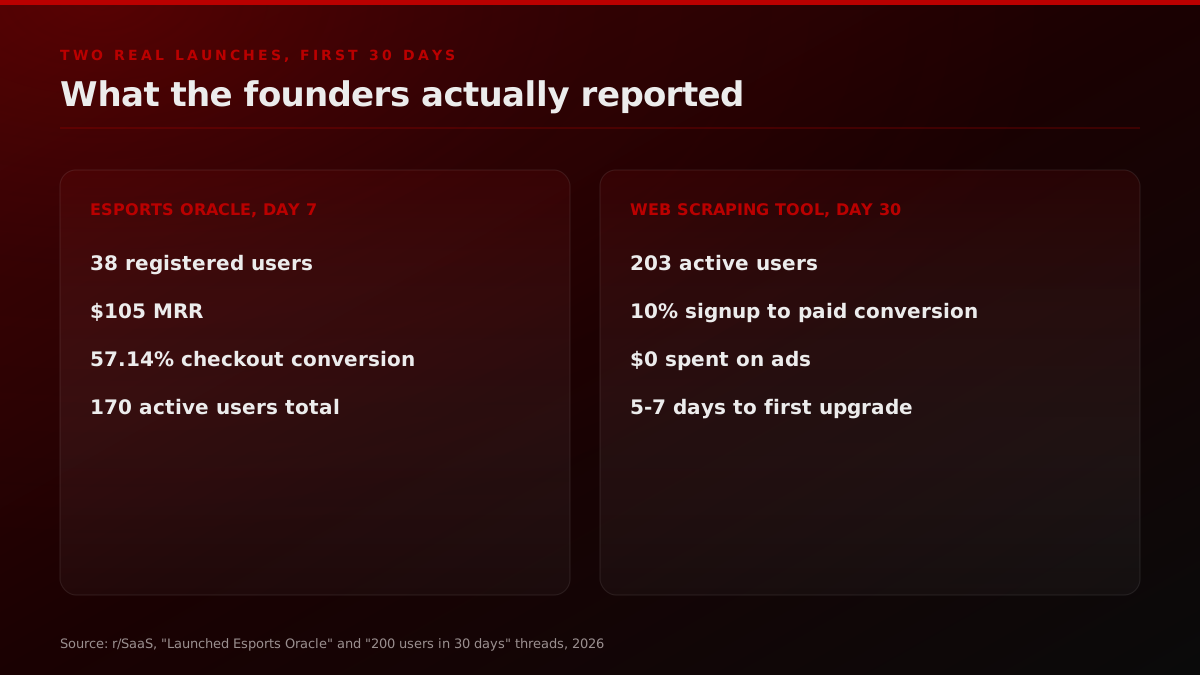
A founder building a web-scraping tool posted a genuinely useful 30-day snapshot: 203 active users, all organic, mostly from Reddit and light SEO, with a 10 percent free-to-paid conversion rate. The detail worth noting is the time-to-upgrade pattern: users tried the free credits, then upgraded only after 5 to 7 days once the tool was embedded into their actual workflow. That lag is a feature of the data, not noise. It shows the product earning trust before it earns money, which is exactly the shape a healthy Day 30 curve should have.
200 users in 30 days with $0 ads. Should I start paid now or keep pushing organic?
A bit more than 30 days after my web scraping solution launch. As for today we have 203 active users. 10% conversion from signup (free trial) to paid. People usually try the free credits, then upgrade only after 5 to 7 days once they integrate it into their workflow.
Contrast that with total signups or social follower counts by Day 30. Both numbers can be inflated with spend, a viral post, or a generous definition of "signup." Neither one tells you whether the 203rd user is going to pay you in month two.
The revenue-per-conversation number is the one most founders skip entirely in the first month, usually because it requires actually picking up the phone or sitting through demos instead of reading a dashboard. That avoidance is understandable and also expensive. A product with a strong Day 14 retention number and a weak revenue-per-conversation number is not a measurement problem, it is a pricing or positioning problem hiding behind a genuinely good product, and the first 30 days is the cheapest window in the company's life to find that out. Waiting until month six to run the same test means running it against a much larger, much more expensive customer acquisition motion, with far less room to adjust the pitch before the market has already formed an opinion.
What launch metrics should you ignore, and why do they keep fooling smart teams?
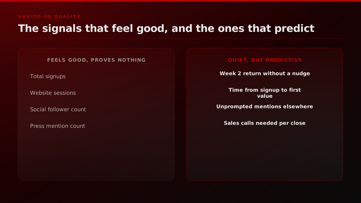
Total signups, website traffic, and social follower counts are not fake numbers. They are real, they are easy to pull from any analytics tool, and they feel good to report in a founder update. The problem is that all three can rise while retention, activation, and revenue per conversation stay completely flat. That combination, rising vanity metrics next to flat quality metrics, is the exact pattern behind almost every "we launched well but then nothing happened" story.
One builder preparing for a second Product Hunt launch after placing top 5 on the first attempt described her pre-launch checklist starting 2 to 4 weeks out, forum participation, replying to other launches, building relationships before asking for anything. None of that prep shows up in a Day 1 signup count. It shows up weeks later, in whether the Day 7 and Day 14 numbers hold. The teams that treat launch day as a finish line are the ones most likely to keep staring at a metric that stopped meaning anything the moment the spike ended.
Maya
buildwithmaya
I launched on product hunt and ended in the top 5 for my first launch. A lot has changed since then, but as I prepare for my second launch this is exactly the steps I am following: Pre Launch, 2-4 weeks out, live in the product hunt forums, reply to other launches, build.
ronan almeida
ronan_0
49 days ago i launched my first app on the app store. today its charting at top #48 in social networking. piko chat is a social app built around pixel art and old internet aesthetics. since launching: 12k+ downloads, ~1k DAU in the last two weeks, 4.3k+ DAU in the last 24h
A solo app-store launch tracked 49 days out reported 12,000-plus downloads against roughly 1,000 daily active users over the trailing two weeks, an 8 percent DAU-to-download ratio that is a far more honest health signal than the download count alone. Downloads answer "did distribution work." DAU answers "did the product work." Reporting only the first number, on its own, is how a launch looks successful in a tweet and quietly fails in the dashboard nobody is checking.
The vanishing-spike problem, illustrated
Every launch curve looks roughly the same shape once you plot it: a flat pre-launch baseline, a sharp spike on launch day, and a multi-week decline back toward whatever the honest steady state turns out to be. The decline is not a sign the product is failing. It is the curiosity traffic finishing what it was always going to do, and the useful comparison is never against the peak, it is against the floor the curve settles at once the noise clears.
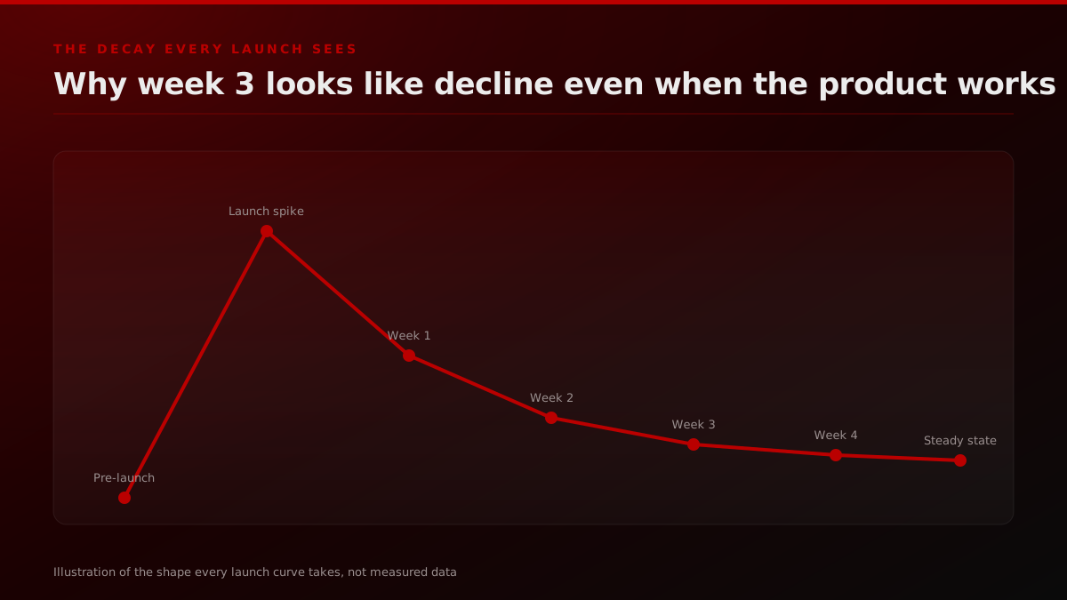
The mistake teams make is treating any point on that decline as new information. It is not. The information arrived once, in the shape of the curve itself, the moment the spike started falling. A product with a real steady state at 200 weekly active users, reached honestly after the noise clears, is in a stronger Day 30 position than one still coasting on a spike that has not finished decaying, even if the second product's absolute numbers look bigger on any given day during the fall. Read the floor, not the day-to-day slope.
How do you actually define your "first value" action?
Activation rate is only useful if the underlying action is defined honestly, and this is where most dashboards quietly go wrong. Teams default to something easy to measure, like "completed signup" or "clicked through onboarding," instead of something that reflects real value delivered. Completing signup is not a first-value action. It is a prerequisite for one.
A first-value action has three properties. It happens inside the product, not on a marketing page. It is specific enough that a new user would recognize it as the moment the product proved its point, not a generic click. And it is early enough to happen within a single session for most products, because if the value moment sits three sessions deep, most of your signups will never see it at all. For a scheduling tool, that might be "sent the first invite that got accepted." For an analytics product, it might be "viewed the first dashboard populated with real data, not a demo." For a marketplace, it is usually the first completed transaction on either side, buyer or seller.
The mistake that costs teams the most is picking a first-value action that is really a vanity checkpoint in disguise, "created a workspace" or "invited a teammate" often measure intent to try the product, not value received from it. If your activation number looks suspiciously good, check whether the action you are measuring is something a curious signup does automatically versus something a satisfied user does deliberately. The gap between those two is usually where the real activation rate is hiding.
Measurement mistakes that outlast the vanity-metrics one
Ignoring signups and follower counts fixes the most visible problem, but three quieter mistakes usually survive that first correction and keep distorting the picture through Day 30: blending cohorts of different ages into one retention number, treating vocal support-channel feedback as a representative sample, and reading a single strong checkpoint as a final verdict instead of permission to run the next test.
The first is blending cohorts. A dashboard that reports "this week's retention" without separating users by their signup week is mixing a fresh Day 2 cohort with a mature Day 20 cohort, and the blended number moves for reasons that have nothing to do with product health, just because the mix of cohorts shifted. Every retention number in this post, and every retention number worth trusting, is cohort-based: people who signed up in a specific week, tracked forward from that week, never blended with a different week's cohort.
The second is survivorship bias in qualitative feedback. The users who show up in a support inbox, a feedback form, or a Slack community are disproportionately the ones who stuck around long enough to have an opinion. That is a real and useful signal, but it is not a representative one, and treating enthusiastic support-channel feedback as proof of broad product-market fit is how teams convince themselves a 6 percent Day 7 retention number is fine because "the users we talk to love it." The users you talk to are the ones who did not churn. The other 94 percent already left, silently, and they are the group that actually needed convincing.
The third is confusing correlation with the checkpoint framework itself. Week-2 retention above 20 percent is a strong signal, not a guarantee, and a product can clear that bar on the strength of a single sticky feature while the rest of the experience is genuinely weak. The checkpoints tell you where to look next, not the final verdict. A strong Day 14 number earns the product a real Day 30 test with paying customers. It does not exempt the team from running that test.
Building the 30-day launch dashboard
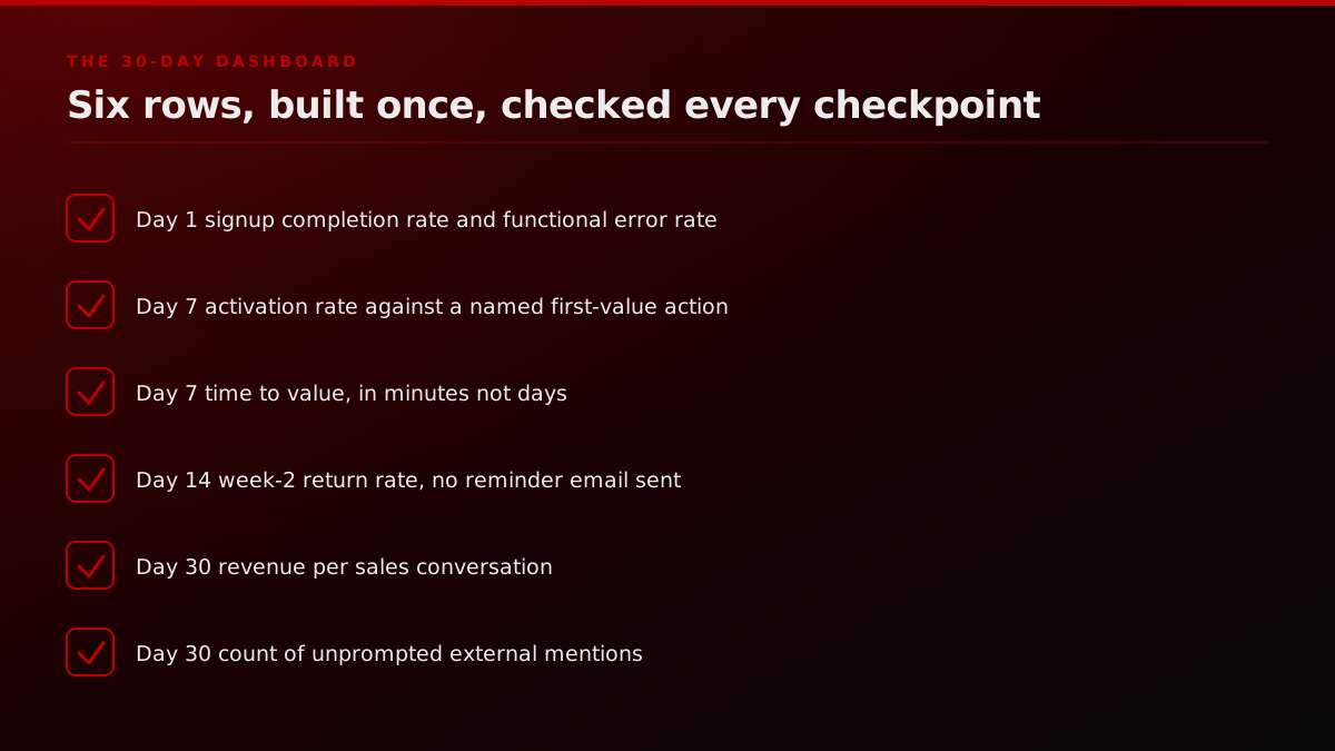
The dashboard itself does not need to be complicated. Six rows, built before launch day and checked at each checkpoint, are enough to answer every question raised above without drowning the team in noise, and every row maps directly to one of the four checkpoints covered earlier in this post rather than to a generic analytics template pulled from somewhere else.
Day 1, 7, and 30 retention benchmarks, all categories
| Checkpoint | Cross-category median | Strong performer (75th percentile) |
|---|---|---|
| Day 1 | 25% | 30-40% |
| Day 7 | 8% | 10-15% |
| Day 30 | 4% | 5-8% |
UXCam, Mobile App Retention Benchmarks, updated April 21, 2026.
Notice what is not on that list: total signups as a headline number, website traffic, social follower count, press mention volume. All four can live in a separate "distribution" tab for context, but none of them earns a place on the six rows that actually decide what happens next.
What do the checkpoints tell you to do next?
The most useful thing about tracking week-2 retention specifically is that it doubles as a decision rule, not just a number to admire. Once you know where it lands, the next move is no longer a judgment call, it follows directly from the checkpoint the same way a medical triage protocol follows from a vital sign, which is exactly the kind of clarity a raw signup count never gives a team staring at it on Day 30.
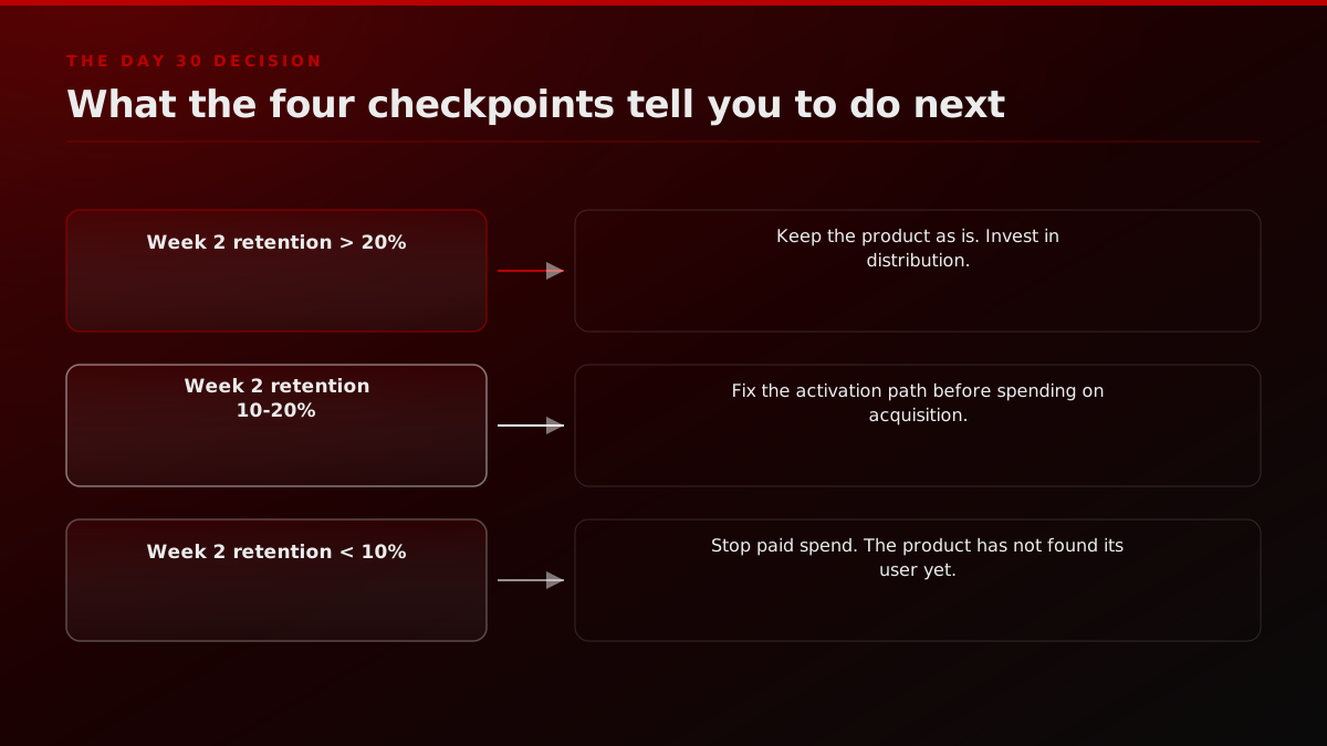
Above 20 percent week-2 retention, the product is generally ready for the distribution investment: paid acquisition, content, partnerships, whatever channel fits. Between 10 and 20 percent, the right move is fixing the activation path first, since pouring paid traffic into a leaky funnel just makes the leak more expensive. Below 10 percent, the honest move is to stop paid spend entirely and treat the number as a signal that the product has not yet found the problem it solves well enough for people to keep using it. None of those three responses require guesswork once the number is in front of you.
How to Set a Great North Star Metric
Exponent
Exponent's walkthrough of how to set a North Star metric that survives past launch week.
Picking the right underlying metric to rally a team around, rather than a scattered list of dashboards nobody agrees on, is its own discipline. Exponent's breakdown of how to set a North Star metric covers the mechanics of choosing one number that actually reflects value delivered, which is the same instinct behind treating week-2 retention as the anchor metric in the first 30 days specifically. Simon-Kucher's Global Software Study found the same principle holding at scale well past the first 30 days: top-performing SaaS companies now treat net revenue retention as the primary growth focus ahead of acquisition, with top performers seeing NRR exceed 120 percent, growing at roughly twice the rate of peers below that threshold. A launch-stage team will not have an NRR number worth reporting yet, but the underlying discipline, one number the whole team rallies around instead of a scattered dashboard, is identical at every stage.
How the launch measurement shifts as distribution fragments
The four-checkpoint framework does not change because of where the traffic came from, but the sourcing of that traffic keeps fragmenting. A 2026 launch's first cohort increasingly arrives through short-form clips, AI answer engine citations, and creator posts as much as through a single Product Hunt spike, which means the Day 1 signup number is even less representative of the eventual user base than it used to be. The fix is the same regardless: stop trusting the acquisition number as a proxy for product health, and let activation and week-2 retention do that job instead. Amplitude's own case data backs this up on the retention side. One SaaS provider using a unified North Star metric reported product activation improving 10 to 15 percent across several products in a year, with retention-focused experimentation adding another 5 to 7 percent on top, entirely separate from any change in top-of-funnel volume.
What FORKOFF tracks when we run a launch
At FORKOFF we build the measurement plan alongside the launch plan itself, never after. Every product launch we run ships with the Day 1/7/14/30 dashboard already wired before the countdown starts, so the team is never staring at a raw signup counter wondering what it means. The viral launch video work we do sits downstream of this exact framework, because a launch asset that drives a great Day 1 spike and a poor Day 7 activation number is a distribution win wrapped around a measurement failure. You can see how we think about the launch model itself, not just the metrics, in our launch strategy breakdown and the full launch playbook.
Distribution and measurement are two halves of the same launch plan, so we pair this framework with the launch-video readiness checklist, the startup launch distribution gap breakdown, and the launch-week sequencing guide for teams still deciding how the launch asset itself should roll out. If the question is closer to "how many views can this realistically earn," the launch view tier estimator and the launch-day timing tool turn that into a number before launch day rather than a guess after it. For teams worried their creator-seeded numbers might not hold up to scrutiny, the launch authenticity checker is the same instinct as this post's Day 7 framework, applied to the traffic itself rather than the retention curve.
The distribution layer underneath a launch's Day 1 spike usually spans more than one channel. KOL and creator placement, Reddit, and Twitter and X distribution each feed a different segment of the first cohort, and each segment behaves differently at Day 7, which is one more reason a blended, unsegmented retention number hides more than it reveals. For a launch that is really the first move in a longer positioning problem, not a single event, the marketing foundation work is where that gets built properly, and a founder who wants a second opinion on the whole plan before committing budget can start from a fractional CMO engagement. You can see the full body of launch coverage, including our roundup of the best product launch videos that earned their numbers, on the FORKOFF press page. If the launch also needs a wire announcement, our product launch press release template covers the format editors actually accept.
The pattern we see most often with founders is not a lack of data, it is too much of the wrong data. A founder who has never tracked week-2 retention before usually has six different traffic dashboards and zero activation dashboards. Fixing that is a half-day of setup, not a research project, and it is the difference between knowing what to do at Day 30 and guessing.
We also see the same conversation happen almost every time a founder looks at their real Day 7 number for the first time after previously only tracking signups: relief, not disappointment. An 11 percent Day 7 retention rate feels alarming when a founder has spent two weeks staring at a signup count that only ever goes up. The same 11 percent feels completely normal, even encouraging, once it is placed next to the actual cross-category benchmark. Half the anxiety in the first 30 days after a launch comes from measuring the wrong thing, not from the product actually underperforming.
The blunt answer
Track four numbers, not four dashboards' worth. Day 1 is functional health. Day 7 is activation rate and time to value. Day 14 is week-2 retention, the number that predicts the most with the least effort to collect. Day 30 is revenue per conversation and organic mentions. Everything else, signups, traffic, followers, press mentions, is context at best and a false alarm at worst. The launches that survive past week three are not the ones with the biggest spike. They are the ones where someone was watching the right four numbers while everyone else was still staring at the one that was already lying to them.
What actually runs this dashboard
None of the four checkpoints require a bespoke analytics build. A product-analytics tool that supports cohort-based retention curves, funnel definitions, and event tracking covers all four rows without custom engineering. Mixpanel's own guidance on post-launch tracking makes the same point from the vendor side: the right metric set follows the business model, not a universal number pulled from a template. The mechanism matters less than the discipline of defining the first-value event before launch day, not after someone asks why activation looks flat.
Two setup habits separate a dashboard that gets checked from one that quietly rots after week one. First, the first-value event and the week-2 return event get named and instrumented before the product ships, not added retroactively once the team realizes it wants the number. A retention curve built from data collected starting on Day 15 cannot answer what happened in week one, and reconstructing it after the fact from server logs is possible but expensive and usually wrong in some small, hard-to-catch way. Second, the dashboard gets a single owner who checks it on a fixed cadence, Day 1, Day 7, Day 14, Day 30, rather than an ad hoc glance whenever someone remembers. A metric nobody is accountable for checking is a metric that will not get acted on even when it says something important.
The revenue-per-conversation number at Day 30 is the one row that genuinely resists automation. It requires someone on the sales or founder side logging how many conversations happened and how many converted, by hand, in a shared sheet if nothing else exists yet. That manual step is worth the friction. It is the number most directly tied to whether the business survives, and it is the one row on the dashboard that a pure product-analytics tool cannot generate on its own.