

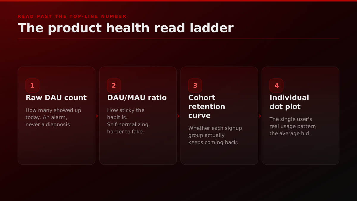
A daily active users count can go up every week while your product quietly dies underneath it. DAU is an aggregate, and an aggregate is a sum over people who behaved for completely different reasons, so it can rise on the back of paid acquisition while the users you already had leak out the bottom. The number that reads real product health is not how many showed up today. It is how many of them come back, which lives one level down in the cohort retention curve, the DAU/MAU stickiness ratio, and the individual view the product world calls a dot plot. This guide walks through how to read each one, then maps the same discipline onto how a growth team should measure distribution.
The 20-second version
A daily active users count is an aggregate, and an aggregate can climb while your real product health falls. Two apps can post the same DAU while one keeps its users for a year and the other loses them in a week, and the top-line number will never tell you which one you are running. Real product health metrics live one level down, in the cohort retention curve, the DAU/MAU stickiness ratio, and the individual view David Lieb calls the dot plot. This guide shows how to read each one step by step, then maps the same discipline onto how FORKOFF measures distribution outcomes: qualified views over raw views, retained cohorts over one-shot spikes.
Last updated 2026-07-18.
What are product health metrics?
Product health metrics are the measurements that tell you whether people keep getting value from a product over time, rather than how many people simply appeared. The durable set is small: cohort retention, the DAU/MAU stickiness ratio, activation rate, and feature adoption. What unites them is that each one is a measure of durability, not attendance. A raw daily active users count answers the question "how many people opened the app today," which feels like health but is actually just traffic. A cohort retention curve answers "of the people who joined in March, how many still use it in June," which is the question that actually predicts whether the business survives. The tool vendors whose entire job is measurement, from UXCam's product health guide to PostHog's take for product engineers, all draw the same line between the two.
The health metric behind each vanity aggregate
| Vanity aggregate | What it actually tells you | The health metric that replaces it |
|---|---|---|
| Daily active users | How many people showed up today | Cohort retention, how many keep coming back |
| Total signups | How much you spent on acquisition | Activation rate, how many reach first value |
| Total sessions or pageviews | Raw volume with no intent attached | DAU/MAU ratio, how sticky the habit is |
| Cumulative installs | A number that can only ever go up | Quick ratio: do new plus revived beat churn? |
Every left-column number can rise while the right-column signal falls, which is exactly how a dashboard hides a dying product.
The distinction matters because the two categories behave in opposite ways under pressure. Vanity aggregates only move in the flattering direction. Cumulative installs can never go down. Total signups only climb. Raw DAU trends up as long as you keep buying traffic. That monotonic niceness is exactly what makes them dangerous, because a number that only ever rises removes the feedback a team needs to notice it is building something no one keeps. Health metrics are uncomfortable by design. A retention curve can crater. A DAU/MAU ratio can slide. Activation can stall. That discomfort is the point, because it is the product telling you the truth before the revenue does. The same logic runs through FORKOFF's founder funnel, where we refuse to report activity when we can report a retained outcome instead.
There is a structural reason teams drift toward the vanity side even when they know better. Vanity aggregates are cheaper to produce, they update in real time, and they almost always point up and to the right, which makes them the path of least resistance in a weekly review under time pressure. A cohort table takes a query and a moment of honesty. A raw active-user count takes one glance. Under a deadline, the glance wins, and the team ends up managing the metric that is easiest to read rather than the one that reflects whether the product is working. The whole discipline of reading product health is really a discipline of choosing the harder number on purpose, week after week, until the harder number becomes the reflex and the glance starts to feel like the shortcut it always was.
What a product health metric is, and the four families the dot plot draws from
What is a product health metric? A number that predicts whether the product will still have its users next quarter, as opposed to a number that describes how many it has today. DAU describes. Retention, stickiness and depth of use predict, which is why this post argues for the dot plot over the DAU line.
The four families. Adoption, meaning new-user growth and time to first value; retention, meaning churn and the curve of users still active by cohort week; stickiness, meaning the ratio of daily to monthly actives and how many core actions a returning user takes; and engagement, meaning feature usage, session depth and the customer satisfaction signals that arrive before churn does. Every metric worth plotting belongs to one of the four, and a dashboard that only has the first is the DAU trap.
How to choose the right metrics for your product. Pick one predictive metric per family, defined against the action that means the product worked (a query run, a document shared, a deposit made), and plot them per cohort rather than per day. The dot plot in the sections below is that choice made visible: each dot a cohort, each axis a family.
Which comes first? Retention by cohort, because it is the one that cannot be gamed by acquisition spend and the one investors read first. The Sequoia framing of health as growth, retention, stickiness and engagement is the closest public description of the same idea, and the metrics in this post map onto it.
For the launch-phase version of these metrics read the product launch plan playbook, and for how distribution shapes the early cohorts, the three-ring SaaS launch.
Reviewed 2026-09-22 against the live search results for this topic: the questions people ask about it, and the pages that rank for it, are reflected in the section above.
Why do daily active users lie about product health?
Daily active users lie because a single blended number averages your most loyal power users and your most fleeting one-time visitors into one figure that describes neither. Two products can post the exact same DAU while one keeps its users for a year and the other loses them within a week, and the headline number will look identical on both dashboards. That is the whole problem in one sentence: DAU measures attendance, and attendance is not health. A packed room tells you nothing about whether anyone will come back tomorrow. The growth investor Andrew Chen made the sharper version of this point years ago, arguing that even the DAU/MAU ratio, a much better metric than raw DAU, breaks down in predictable ways when a product is not meant to be used daily in the first place.
You can feel the lie in a single question that founders ask each other constantly, and the answers are always revealing. Would you rather have 2,500 daily active users or 60 paying customers? The number that looks bigger is almost never the one that means the business is healthy, and everyone knows it the moment they have to choose.
Ksenia Moskalenko
@kseniam0s
Be honest would you rather have: - 2,500 daily active users - 60 paying customers
Now make it concrete. Picture two apps, both reporting ten thousand daily active users, which any investor deck would present as identical traction. Under the hood, App A retains 60 percent of each signup cohort after 30 days and its curve has flattened into a stable plateau. App B retains 8 percent after 30 days and its curve is still sliding toward zero, propped up entirely by a paid-acquisition firehose that replaces the users leaking out. Same DAU. One is a business and the other is a countdown. The blended number physically cannot distinguish them, which is why reading it alone is a decision made blind.

The mechanism that makes App B's number hold is worth naming, because it is the most common way a dashboard lies by omission. When a product leaks users but keeps buying new ones at the same rate, the daily count stabilizes at a plausible-looking plateau that has nothing to do with retention and everything to do with spend. Cut the acquisition budget for two weeks and the true curve appears underneath, usually as a drop that shocks a team who thought they had a stable base. A healthy DAU is load-bearing on its own. An unhealthy DAU is load-bearing on a credit card, and the only way to tell them apart from the outside is to read the cohort, which is exactly the durable demand a three-ring launch distribution is built to earn before a single dollar of paid acquisition papers over the gap.
This is not an argument against ever looking at DAU. It is an argument about sequence and company. DAU is a perfectly good alarm, a signal that something changed and deserves a look. It becomes a vanity aggregate the moment it is reported alone, without a retention curve or a stickiness ratio standing next to it to explain what the change actually means. Tableau's own explainer on vanity metrics draws the line at exactly this point: a metric is vanity not because of what it counts but because of whether you can act on it, and a bare active-user count with no cohort behind it is the most common un-actionable number on any founder's screen.
What is a dot plot, and how does it read health a DAU chart cannot?
A dot plot is a way of seeing individual user behavior instead of an averaged line, and it is the technique David Lieb walks through in a Y Combinator Startup School talk on actually seeing what your users do. Lieb, who founded Bump and was later a founding product lead on Google Photos, argues that most teams stare at aggregate dashboards while the sharpest product insight lives in the behavior of specific users. A dot plot plots each user as their own row across time, so a pattern that an average would smooth into a flat line, say a small cluster of intensely engaged users hidden inside a mediocre overall number, becomes visible as its own shape. It is the product-analytics answer to the same problem DAU has: the aggregate hides the individual, and the individual is where the truth is.
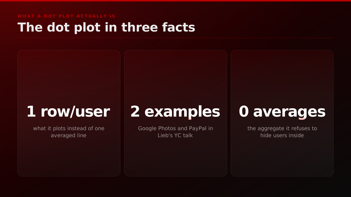
Lieb's framing is worth quoting directly, because it names precisely what the top-line chart cannot show you.
What you don't know is how they are interacting with your product, what features they are using, what the pacing of their usage is.
His point is that the aggregate does not just under-inform you, it actively conceals structure. In the talk he illustrates the technique with examples drawn from real products he has worked on and studied, including Google Photos and PayPal, using the dot plot to surface patterns in how individuals actually behaved that the summary numbers had averaged away. The specific insights are his to tell, but the mechanism generalizes to any product: when you drop from the average to the individual rows, you start seeing the shape of usage rather than its mean.
You can start seeing patterns that you would not have seen just looking at aggregate charts or looking at your user logs.
What makes the dot plot more than a visualization trick is that it changes the questions you can ask. An aggregate retention number lets you ask whether retention went up. A view of individual users lets you ask why, because you can see the specific accounts that stuck, open their actual usage, and find the behavior they share. That behavior, the thing your best-retained users all do in their first week, is the single most valuable input to activation you can find, and it is invisible in any average. The teams that compound fastest are usually the ones that have simply spent the most hours looking at individual usage, because that is where the non-obvious pattern lives, and the dot plot is just the tool that makes those hours efficient instead of exhausting.
The reason this matters for a marketer as much as a product manager is that the dot plot and the cohort curve are the same idea wearing different clothes. Both refuse to let a single number stand in for a distribution of people. A founder who only reads aggregate product metrics is making the identical mistake as one who only reads aggregate marketing metrics, and the fix is identical too: drop down a level and look at the individuals or the cohorts underneath. We wrote the marketing-side companion to this argument in our piece on the growth signal your dashboard hides, which applies the same watch-the-individual discipline to distribution and attribution rather than product analytics.
The SaaS metrics that get tracked most obsessively are usually the ones that feel good to report, not the ones that predict survival.
You can watch the instinct playing out in the open. On r/SaaS, the threads that resonate most are the ones admitting that the metrics teams track most obsessively are usually the ones that feel good to report, not the ones that predict survival. That is the dot-plot lesson stated as a confession: the comfortable aggregate wins the dashboard while the uncomfortable individual signal actually decides the outcome.
How do you read a cohort retention curve, step by step?
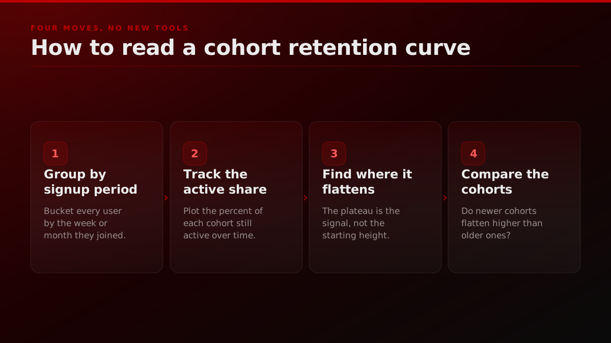
You read a cohort retention curve by grouping users into cohorts by the period they joined, tracking what share of each cohort is still active in the weeks or months that follow, then reading where the curve flattens. The steps are mechanical. First, bucket every user by their signup week or month so each cohort is a fixed group of people. Second, for each cohort, plot the percentage still active in period one, period two, period four, and so on. Third, and this is the whole game, find the period where the line stops falling. Fourth, compare cohorts to see whether newer ones flatten higher than older ones, which tells you if your product is getting stickier over time. Lenny Rachitsky's guide to measuring cohort retention and Reforge's basics of cohort analysis both walk this exact sequence.
The single most important thing to internalize is that the plateau, not the starting height, is the signal. A curve that starts at 90 percent and decays smoothly toward zero is a worse product than one that starts at 40 percent and holds a flat line forever, because the second one has found a real audience that keeps coming back on its own and the first one has not. This is genuinely counterintuitive, and it is why teams that only glance at the first-week number keep getting fooled. The health is in whether the curve levels off, and at what altitude, not in how impressive it looks in the first period before the churn has had time to show.
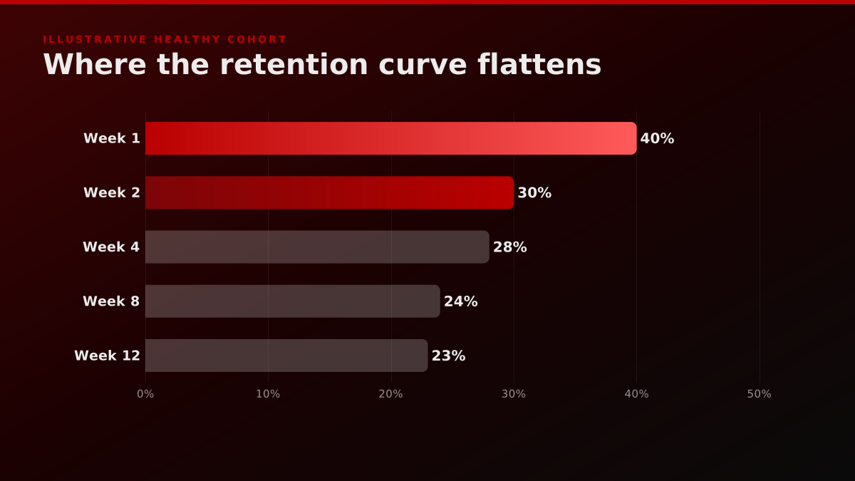
A quick worked example makes the plateau concrete. Say your March cohort is 1,000 signups. By week one, 400 are still active, a 40 percent first-week number that looks unremarkable. By week four, 280 are active. By week eight, 240. By week twelve, 235. That curve is flattening onto a plateau around 23 to 24 percent, which means roughly a quarter of every cohort becomes a durable, self-sustaining user. That is a healthy product, even though its first-week number was nothing to brag about. Now imagine a different cohort that starts at 700 active in week one, a far prettier headline, but slides to 400, then 210, then 90, then 30 by week twelve. That one is a cliff wearing a good first impression, and it is the product that will surprise its founders with a churn crisis two quarters later. Read them side by side and the starting height stops mattering almost entirely.
It helps to have the language for the shapes, because naming the curve is most of reading it. A curve that drops straight toward zero is a cliff, and a cliff means you have no retention at all, only churn with a marketing budget attached. A curve that keeps sliding without ever leveling off is a slow decay, which means a real audience exists but you are losing it faster than you should. A curve that falls and then holds a stable line is a flattening plateau, the baseline definition of a healthy product. And the rare curve that falls, flattens, and then bends back upward is a smile, which means the product is expanding within its own retained base, the single best shape in analytics.

Watching a good walkthrough helps this click faster than any static chart. The read below shows how investors work through a cohort table to judge whether a product actually keeps its users, which is the same read a founder should run on their own numbers every month.
Customer Retention and Cohort Analysis | How VCs Calculate Customer Retention
Eric Andrews
A walkthrough of cohort retention analysis and how investors read whether a product actually keeps its users.
What is a healthy DAU/MAU ratio, and why is the ratio still not the whole story?
The DAU/MAU ratio divides daily active users by monthly active users to measure stickiness, effectively answering how many days out of a month a typical user shows up. As a rough calibration, a ratio around 20 percent is commonly cited as solid for a consumer product and 50 percent as exceptional, the territory of the daily-habit apps. Geckoboard's KPI reference and Gainsight's DAU/MAU guide both lay out the formula and these benchmark bands. The ratio is a genuine upgrade on raw DAU because it is self-normalizing: it cannot be inflated just by pouring in new users, since new users raise the numerator and the denominator together. That alone makes it one of the most honest single numbers you can watch.
Andrew Chen: DAU/MAU is important, but here is where it fails
The growth investor Andrew Chen has written that DAU/MAU is a useful stickiness metric that also breaks down in predictable ways, because it flattens the difference between products that are meant to be used every day and products that are valuable precisely because you only need them occasionally. A calendar app and a tax tool cannot be judged by the same ratio. The lesson is that no single top-line number, DAU included, is self-explaining. You have to know what durable usage looks like for your specific product before any active-user count means anything.
Source: Andrew Chen, DAU/MAU is an important metric, but here's where it fails
But the ratio still is not the whole story, and treating it as a universal target is its own mistake. A daily-use product like a messaging app and an occasional-use product like a tax filing tool cannot be judged by the same benchmark, because a low DAU/MAU is a failure for one and completely expected for the other. This is the exact failure mode Andrew Chen warned about: no single number, however clever, is self-explaining. You have to know what healthy usage frequency looks like for your specific product before any ratio means anything, and then you read the ratio in the context of the cohort curve, not instead of it. Stickiness tells you how often retained users return. The cohort curve tells you whether they are retained at all. You need both.
Computing the ratio honestly is where teams quietly fool themselves. DAU should be an average of daily active users across the month, not a single cherry-picked peak day, and MAU should be the count of unique users active at least once in that same window. Use a peak DAU against an average MAU and you manufacture a stickiness number that does not exist. The other common error is counting a bare login as activity when your product's real value event is something deeper, like sending a message or completing a task. If the denominator counts drive-by logins, the ratio flatters you the same way raw DAU does. The metric is only as honest as the definition of active underneath it, which is why the first hour of any stickiness project is spent arguing about what active should actually mean for this specific product.
Amplitude and Mixpanel both teach retention as the health signal
The two most widely used product-analytics platforms converge on the same point in their own documentation. Amplitude frames cohort analysis as the way to reduce churn by watching how specific groups of users behave over their lifetime, and Mixpanel's cohort guide is built entirely around reading the retention chart rather than a single headline metric. When the vendors whose business is measurement tell you to look past the top-line number and into the cohort, that is the strongest possible signal about which metric actually predicts survival.
Source: Amplitude and Mixpanel cohort analysis guides
The product health metrics that actually matter
The metrics that actually read product health are the ones that survive the test of whether a number moving would change what you do next. There are six worth building a scorecard around, and each one answers a specific question a raw daily active users count cannot. Cohort retention answers whether users stay. The DAU/MAU ratio answers how sticky the habit is. Activation rate answers whether new users reach first value before they bounce. Feature adoption answers whether the thing you shipped is actually used. The quick ratio answers whether new plus resurrected users are outrunning churned ones. And time to value answers how fast a signup becomes a real user. None of them can be gamed by acquisition alone, which is exactly why they are the honest ones.
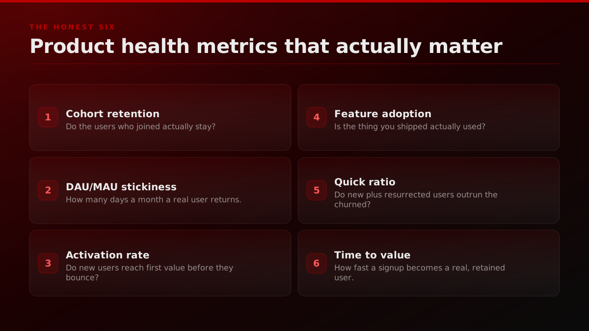
The most useful of these in practice is often the quick ratio, because it forces the aggregate to admit its churn. A product can add a thousand new users a month and feel like it is growing, but if it is also losing nine hundred, the real net is a hundred, and the quick ratio is the number that refuses to let the thousand hide the nine hundred. Userpilot's product health breakdown and Baremetrics on the vanity metrics to stop using both push teams toward these net, retention-anchored numbers and away from the gross totals that only ever flatter. The pattern is consistent across every credible source: the metric that matters is almost always the one that can go down.
Activation and time to value deserve special attention because they are the metrics you can most directly move, and they sit upstream of everything else. Activation rate is the share of new users who reach the moment where the product's value becomes obvious, the first sent invoice, the first published post, the first successful import. If that number is low, no amount of acquisition will fix retention, because you are pouring users into an experience that never lands. Time to value measures how long reaching that moment takes, and shortening it is often the single highest-leverage change a product team can make, since every hour of friction before first value is an hour in which a real person decides you are not worth it. Both are individual by nature. You find them by watching specific users hit or miss the moment, not by reading a funnel average, which is the dot-plot lesson applied to onboarding.
Four cohort retention curve shapes and what each means
| Curve shape | What it looks like | What it means for product health |
|---|---|---|
| The cliff | Drops toward zero within a few periods | No retention. You rent attention, not build. |
| The slow decay | Keeps sliding down, never levels off | Leaky. A real audience, lost too fast. |
| The flattening plateau | Falls, then holds a stable line | Healthy. A durable core keeps returning. |
| The smile | Falls, flattens, then curves back up | Exceptional. It expands within its base. |
The plateau, not the starting height, is the signal. A curve that starts at 90 percent and decays to zero is worse than one that starts at 40 percent and holds.
You can see founders arriving at this the hard way in public. There is an r/SaaS thread from a founder who got more than 250 developers using their product in four days and generated exactly zero revenue, and the whole discussion is a live demonstration of learning which growth metrics lie. The usage number was real. It just was not health, because none of it converted or retained into anything durable, and the founder had to feel that gap before the metric made sense.
How I got 250+ developers to use my SaaS in 4 days but $0 revenue taught me what growth metrics lie.
Operator noteWe treat a client's raw view count the way a good PM treats raw DAU. It is the alarm, never the diagnosis., FORKOFF distribution ledger
How FORKOFF reads distribution health the same way
The reason this is not just a product-analytics post is that the exact same discipline governs how a serious growth team should measure marketing, and it is how FORKOFF's founder funnel is built. Distribution has its own version of the DAU lie, and it is even more seductive: the raw view count. A clipping campaign can post five million views and drive almost nothing, or post two hundred thousand views and drive a launch, and the blended total will never tell you which one you are running, in precisely the same way that ten thousand DAU cannot tell App A from App B. So we do not report the aggregate. We instrument every service against an individual unit, which is the marketing equivalent of a cohort, and we read that unit instead of the flattering total.

The mapping is concrete across the stack. Clipping is read by the single clip that drove installs, not blended views, which is why our qualified-views measurement reports the view that produced an outcome rather than the raw one, and why our managed clipping playbook treats view count the way a good PM treats DAU. Reddit marketing is read by the exact thread and comment that produced a qualified reply. The founder funnel is read by the single touch, one podcast appearance, intro, or conversation at an events activation, that measurably moved a deal. Twitter and X growth is read by the reply that turned a lurker into a lead, and influencer marketing by the individual creator whose audience actually converted rather than the sum of everyone's reach. In answer engine optimization and GEO, the unit is the exact query where an engine cited us, which is worth more than a thousand blended impressions.
Operator noteA campaign can post five million views and drive nothing. The cohort of viewers who came back is the real read., FORKOFF clipping network
The proof point behind this is our own scale. The FORKOFF clipping network has processed more than 5 billion views, and the number is useful to us for the opposite of the obvious reason. Its value is not its size. It is that every one of those views is attributable to an individual clip, creator, and platform, so we can read which single short actually moved installs and which several million were ambient noise, exactly the way a cohort table separates the retained from the churned. That is what turns a vanity view count into a health metric, and it is the same move David Lieb makes when he drops from an aggregate chart to a dot plot.

Sequoia: measure product health, not product vanity
Sequoia's own note on measuring product health argues that the metrics worth building a company around are the ones that track whether users get repeated value, not the ones that look best on a launch tweet. That is the same instinct that makes cohort retention and stickiness the durable metrics and makes cumulative installs and raw DAU the ones that flatter you into complacency. The framing matters because it comes from the funding side, where the difference between a vanity aggregate and a health metric is measured in write-downs.
Source: Sequoia Capital, Measuring Product Health
This is also why we price the way we do. If you can only measure activity in aggregate, you can only ever charge for activity, but if you measure the retained, individual outcome, you can price on the outcome itself, which we broke down in our piece on AI agency pricing and unit economics. Founders weighing whether to run this internally or bring in outside help should ask exactly one diagnostic question, the marketing version of the cohort test: does your current reporting let you name the single clip, thread, or touch that produced your last retained customer? If the honest answer is no, the growth function is flying on DAU.
Your product-health read: what to run this week
None of this requires a new analytics platform or a data hire. It requires pointing your attention below the top-line number for one week, and you can start with five moves you already have the tools for. Build one cohort table from last quarter's signups. Write down your honest DAU/MAU ratio and decide what healthy means for how often your product is actually meant to be used. Find the period where each cohort's retention curve flattens, or admit that it does not. Read the individual activity of five real users the way Lieb reads a dot plot, looking for a pattern the aggregate hid. Then ship exactly one change to the path to first value and watch what the next cohort does. Do that on a fixed weekly cadence and you will learn more about your real product health in a month than a year of watching DAU ever taught you.
The weekly product health read
STEPS- 01
Monday: build one cohort table
Group last quarter's signups by their signup week and track the active share of each cohort across the following weeks.
- 02
Tuesday: name your stickiness ratio
Divide daily active users by monthly active users and write down the honest number, then decide what healthy means for how often your product is meant to be used.
- 03
Wednesday: find where the curve flattens
Look for the period where each cohort's retention stops falling. If it never flattens, you have a leak, not a plateau.
- 04
Thursday: read five individual users
Pull the actual activity of five real accounts, the dot-plot move, and look for a usage pattern the aggregate curve hid.
- 05
Friday: ship one activation fix
Change one thing in the path to first value based on what the cohorts and the individuals showed you, then watch the next cohort.

Operator noteIf a report cannot name the single clip or thread that converted, it is measuring attendance, not health., FORKOFF measurement standard
The daily active users number is not the enemy. It is the smoke alarm. It is very good at telling you something changed and completely silent on whether your product is actually healthy, which is a different question with a different answer that lives one level down. The teams that compound are the ones that treat the aggregate as the prompt to go look, not the answer, and then drop to the cohort and the individual where the truth actually lives. The same is true of every view, thread, and touch in your distribution. Go read the ones underneath the total.
Reading real product health is a discipline, not a dashboard. It is the habit of refusing to let a single blended number, whether it is DAU on the product side or raw views on the marketing side, stand in for the distribution of real people underneath it. Learn to read the cohort curve, name your stickiness honestly, and drop to the individual when the aggregate goes quiet, and you will stop being surprised by the churn that a rising line was hiding all along.