Your growth dashboard can tell you signups rose twelve percent this week. It cannot tell you which person signed up, which specific thread or clip moved them, or what they said out loud right before they did. That missing detail, the individual-level signal, is where the sharpest growth decisions actually come from. This is the marketing translation of a product lesson that keeps getting rediscovered: stop reading the average, and go watch one real user.
Last updated 2026-07-11.
The 30-second answer
Aggregate funnel dashboards are a scoreboard, not a diagnosis. They tell you a number moved, never who moved it or why, because the average describes a user who does not exist. The strongest growth signal lives one rung down, at the level of a single clip, a single thread, a single conversation, or a single session. Nielsen Norman Group's research puts the leverage in numbers, watching five users surfaces roughly 85 percent of what is broken in an interface. This is the marketing version of the product lesson David Lieb laid out in a Y Combinator Startup School episode, that the best insights come from watching how individual users actually behave. Below, why aggregate metrics mislead, how to read the individual signal instead, and the exact instrumentation FORKOFF runs across clipping, Reddit marketing, and the founder funnel so every result traces back to a specific person and a specific cause.
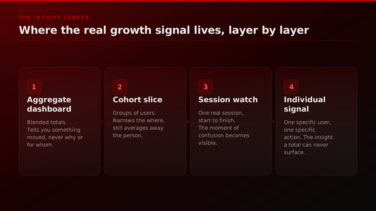
The dashboard tells you a number moved. It never tells you who, or why.
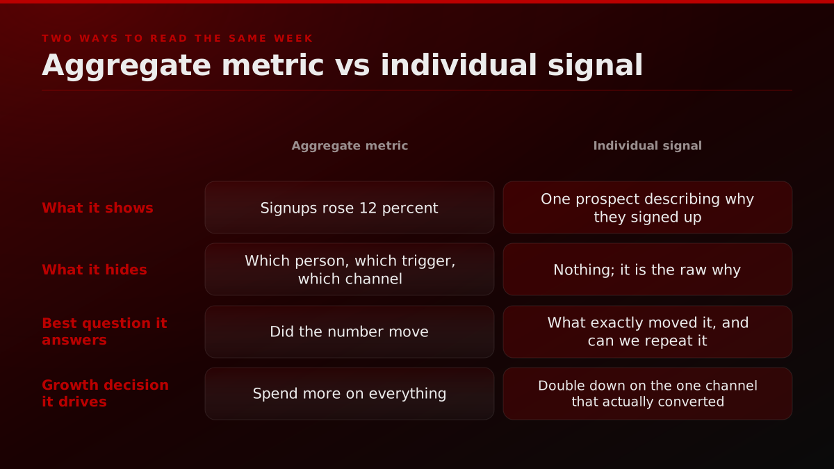
Start with the moment every growth review runs on. Signups are up twelve percent, or down eight, and the room spends forty minutes theorizing about why. The dashboard that triggered the conversation is genuinely useful for one thing, noticing that something changed. It is close to useless for the only question that matters next, which is what specifically changed it, because it has already averaged that answer out of existence.
An aggregate number is a sum over people who behaved for completely different reasons. The twelve percent lift might be one channel doubling while two others quietly collapsed. It might be a single viral thread, invisible in the total, carrying the whole week. It might be a seasonal blip that will reverse on its own. The dashboard cannot tell these apart, and any growth decision you make from the blended number is a guess dressed up as data. The Amplitude team frames vanity metrics exactly this way, as numbers that rise and fall without ever telling you what to do differently, and a blended signup count with no source attached is the most common one on any founder's screen.
This is not an argument against measurement. It is an argument about which measurement carries a decision. A north-star metric is still worth watching as an alarm. But the alarm is not the diagnosis, and treating the top-line chart as if it explains itself is how teams spend a quarter optimizing a number they never actually understood.
What David Lieb actually said, and why it is a marketing lesson too
The reason this is worth writing about now is that one of the sharpest product minds in the ecosystem just said it plainly, and a lot of founders nodded at the product version without noticing the growth version sitting right next to it. In a Y Combinator Startup School episode, David Lieb, the founder of Bump and later Google Photos, argued that most founders obsess over dashboards and aggregate metrics while some of the best product insights come from understanding how individual users actually use the product.
Y Combinator
@ycombinator
Most founders obsess over dashboards and aggregate metrics, but some of the best product insights come from understanding how individual users actually use their product. In this episode of Startup School, YC's @dflieb walks through one of his favorite tools for better…
Lieb was talking about product, and his favorite tool for it is a technique he calls dot plots, a way to see individual user behavior instead of a smoothed average. The full Startup School walkthrough runs about fourteen minutes and is worth watching in its own right. But hold the product framing up against a marketing dashboard and the parallel is exact. Everything Lieb says about product analytics applies, word for word, to growth analytics. The founder who only reads aggregate funnel metrics is making the same mistake as the founder who only reads aggregate product metrics, and the fix is the same, drop down to the individual and watch.
Dot Plots: How to Actually See What Your Users Are Doing
Y Combinator
David Lieb's Startup School walkthrough of dot plots, a tool for seeing what individual users actually do.
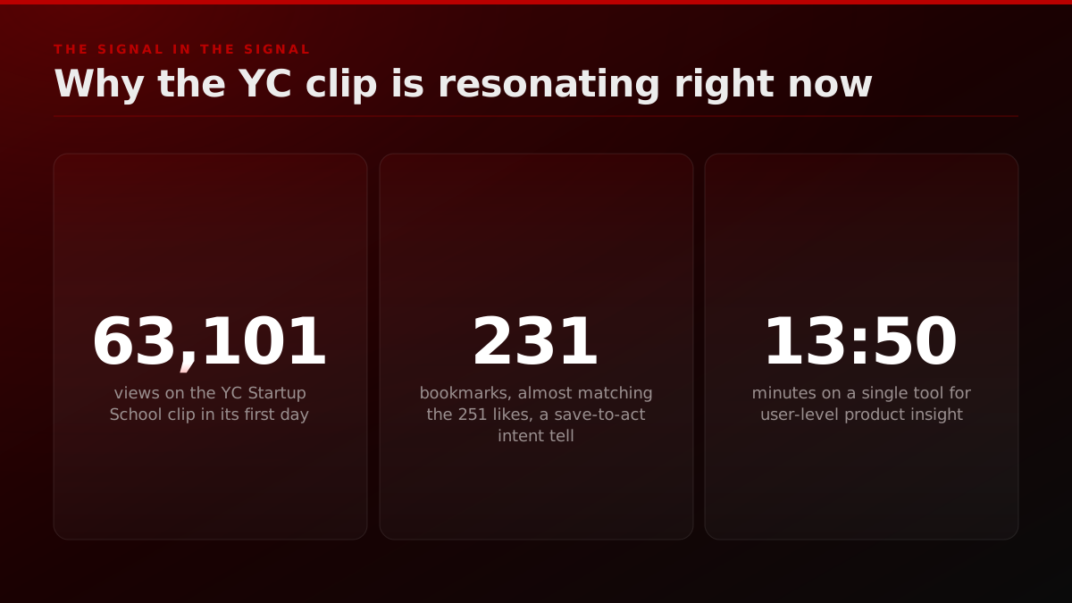
The tweet itself carries a small individual-level tell that proves the point. The clip pulled 251 likes and, right behind it, 231 bookmarks in its first day against 63,101 views. A bookmark count that nearly matches the like count is not a vanity number, it is a save-to-act signal, people flagging the idea to come back and apply it. An aggregate engagement rate would have blurred that. Reading the individual composition of the engagement is what surfaces it.
Aggregate metrics are an average of people who do not exist
The core problem with an aggregate is philosophical before it is practical. The average user has 1.9 children, uses your product 3.4 times a week, and lives in a house that is 62 percent likely to have a garage. No actual person matches that description. When you optimize for the average, you optimize for a fiction, and you routinely make the experience worse for the real distribution of people underneath it.
This is why the same aggregate can support two opposite growth decisions. A flat retention line can hide a product that is losing casual users at exactly the rate it is gaining power users, which is a business that is quietly getting healthier while its dashboard says nothing is happening. The Mixpanel guide to vanity metrics makes the same point from the reporting side, that a single top-line number is precisely the shape of data most likely to be technically true and directionally useless. The average is where signal goes to die.
There is a reason this keeps mattering more, not less. According to CB Insights' analysis of why startups fail, built on post-mortems of 431 VC-backed companies that shut down since 2023, poor product-market fit is cited in 43 percent of the failures with an identifiable cause. A team staring at aggregate engagement can post rising charts for months while shipping something no specific person needs, because the aggregate never forces you to look at whether any real individual is getting real value. The dashboard is a comfortable place to avoid the hardest question in growth, which is who exactly is this for and are they actually pulling.
Why VC-backed startups fail, CB Insights post-mortem analysis
| Cited cause of failure | Share of failures | Aggregate or individual failure |
|---|---|---|
| Ran out of capital | 70% | Final cause, usually downstream of the others |
| Poor product-market fit | 43% | Nobody watched whether a specific person got value |
| Bad timing or macro conditions | 29% | External, but individual signal flags it early |
| Unsustainable unit economics | 19% | Blended CAC hid which channel actually converted |
CB Insights analysis of 431 VC-backed companies that shut down since 2023, 385 with identifiable failure reasons. Companies cite multiple causes, so shares exceed 100%.
The market-fit failure is an aggregate-reading failure
CB Insights' post-mortem analysis of 431 VC-backed startups that shut down since 2023 found poor product-market fit cited in 43 percent of the failures with an identifiable cause, and the 70 percent that ran out of capital usually hit that wall downstream of the same mistake. A team staring at aggregate engagement can post rising charts for months while shipping something no specific person needs, because the aggregate never forces the question of whether any real individual is getting real value. The dashboard is where that question goes to hide.
Source: CB Insights, The Top Reasons Startups Fail, 431 company post-mortems
When the aggregate lies in the exact opposite direction
The failure mode is worse than blurring, because an aggregate can point you the wrong way with total confidence. This is Simpson's paradox, and it shows up in growth data constantly. Imagine you run two acquisition channels. Paid search converts twenty percent of the people it sends, and a niche community converts eight percent. Blended, your conversion rate looks like eleven percent and rising, so the obvious read is to pour more budget into whatever is scaling. But if the community is scaling faster in raw volume, the blended rate can climb while your best channel by conversion quietly shrinks as a share of the mix. The aggregate says everything is improving. The individual channel view says you are defunding your highest-intent source.
Nobody makes this mistake on purpose. They make it because the dashboard presents the blended number first, cleanest, and biggest, and the disaggregated view is three clicks away in a menu nobody opens during a fast growth review. The fix is not more sophisticated math. It is a habit of always asking the same follow-up question when a top-line number moves, which specific segment, channel, or person moved it, and refusing to make a decision until that question has a name attached to it. A number without a name behind it is not a finding, it is a prompt to go looking.
The growth version of "talk to your users"
The product world already solved the philosophical half of this, and the solution has a slogan. Paul Graham's essay Do Things That Don't Scale, published in 2013 and still assigned to every YC batch, argues that founders should recruit users manually and get an almost unscalably deep understanding of a small number of them. Y Combinator's own guide, How to Talk to Your Users, turns that into a discipline, ask about specific past behavior, not hypothetical future intent, and mine the exact language people use.
The feedback you get from engaging directly with your earliest users will be the best you ever get.
Here is the part most growth teams miss. That advice is not only about building the product. It is the highest-leverage marketing research you can do, and it is free. The exact words a prospect uses to describe their problem become your next headline. The specific objection a lost deal raised becomes your next comparison page. The one channel a real customer names when you ask how they found you becomes your next budget line. Marketing assembled from individual conversations converts better than marketing assembled from a survey average, for the same reason product assembled from real users beats product assembled from a spec.
I'll use your product for the first time and tell you what I see
You can watch the instinct play out in public. On r/SideProject, founders repeatedly offer to be the first-time user for someone else's product and narrate exactly what they see, and the comments fill with builders who learn more from one over-the-shoulder walkthrough than from a month of analytics. That instinct, put a real human in front of the thing and watch, is the same one that should govern where your marketing dollars go. Our founder-led growth playbook leans on it directly, because a founder who is close to individual users writes copy no agency ghostwriter can match.
Six questions your funnel dashboard can never answer
The fastest way to feel the gap is to write down the questions that actually decide where growth budget goes, and notice that a dashboard answers none of them. Which specific thread converted, not the traffic total. What did the user say out loud, in their words. Where did the one buyer hesitate, on which screen. Which clip drove the install, not blended views. What touch actually closed the deal. Who is your single best user, the one whose behavior you would clone across acquisition if you could.
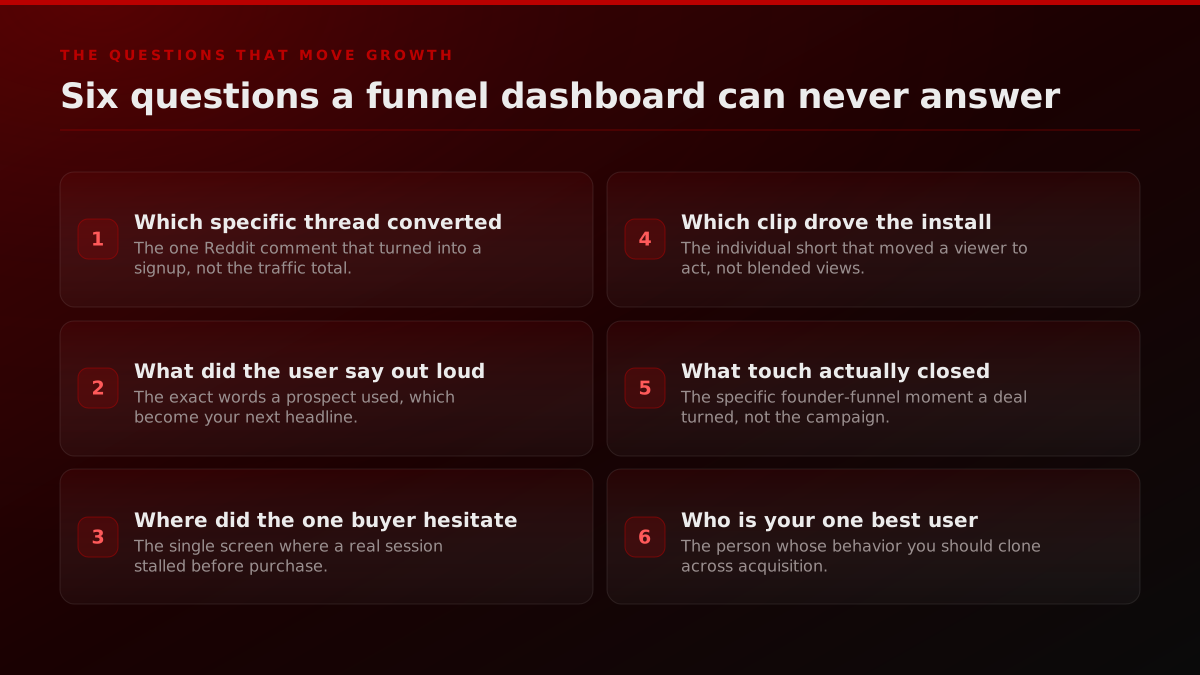
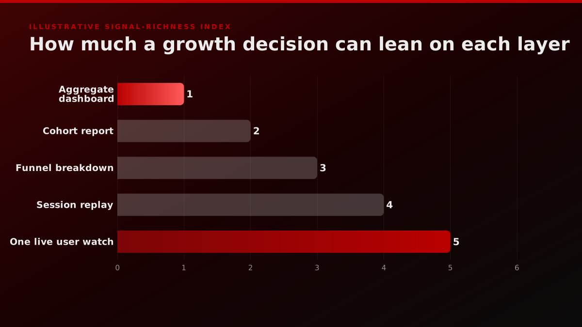
Every one of those is answerable. None of them is answerable in aggregate. The Nielsen Norman Group's usability research established decades ago that watching just five users uncovers roughly 85 percent of the usability problems in an interface, a finding that scandalizes people who trust in large samples precisely because it is so cheap. The growth analog is just as uncomfortable and just as true, watching five real prospects move through your funnel surfaces most of what is actually breaking your conversion, and no amount of dashboard-staring substitutes for it. The sample you need to find the signal is far smaller than the sample you need to prove it to a board, and founders routinely confuse the two.
Problem discovery by users observed (NN/g model, L = 31%)
| Users watched | Share of problems found | What the curve says |
|---|---|---|
| 1 | 31% | Almost a third of the learnable, from one person |
| 2 | 52% | Second user repeats some findings, adds new ones |
| 3 | 67% | Two thirds visible, patterns start to repeat |
| 5 | 85% | NN/g's recommended stopping point per test round |
| 15 | ~100% | Full discovery, better run as 3 rounds of five |
Computed from Nielsen Norman Group's published curve, problems found = N(1-(1-L)^n) with L = 31%, the average per-user discovery rate across NN/g's studied projects.
Five users find most of what is broken
Nielsen Norman Group's usability research model puts a number on why individual observation is so cheap and so underused. A single test user already surfaces almost a third of everything there is to learn about a design, the typical per-user discovery rate averaged 31 percent across the projects NN/g studied, and by the fifth user you have seen roughly 85 percent of the problems and are mostly watching the same findings repeat. The growth translation is direct, you do not need a statistically significant sample to find the signal, you need five real people and the discipline to watch them end to end. Large samples are for proving, small ones are for discovering.
Source: Nielsen Norman Group, Why You Only Need to Test with 5 Users
Notice what each of those six questions has in common. Every one names a single unit, a thread, a word, a screen, a clip, a touch, a person, and every one is the kind of thing you could screenshot and point at in a meeting. That is the practical test for whether you are looking at a growth signal or a vanity metric. If you can point at a specific artifact and say this, right here, is what happened, you have a signal. If the best you can do is gesture at a line that went up, you have a scoreboard. The NN/g usability testing method is built entirely on producing pointable artifacts, the recorded moment a real person got stuck, and growth deserves the same standard of evidence.
The five dashboard habits that bury your best signal
If the individual signal is so valuable, why do teams keep missing it? Because several habits that feel like rigor actively hide it. Reading blended totals averages your best and worst channels into one line. Chasing vanity metrics, impressions and follower counts, feels like progress and predicts no revenue. Trusting last-click attribution collapses a multi-touch journey into one convenient line item. Reviewing weekly rollups means the individual moment that caused the number is already gone by the time you see it. And never actually watching a session means you know that people dropped without ever knowing why.
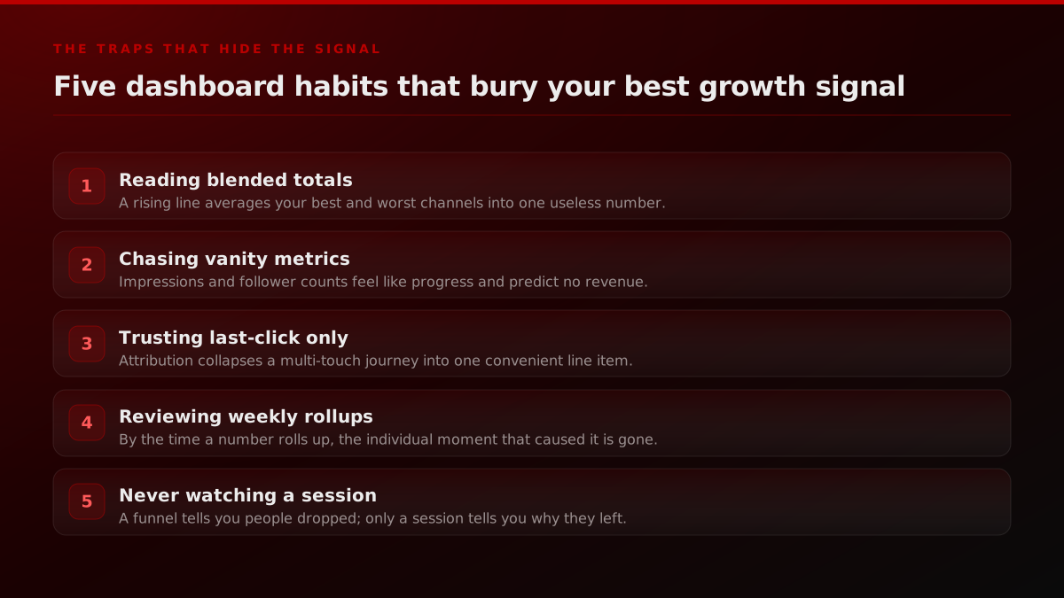
The last one is the quiet killer. A funnel tells you twenty percent of users abandoned at checkout. A single session recording shows you the one field where a real person got confused, gave up, and left. Same event, two completely different levels of understanding, and only the second one tells you what to change. This is also the difference between a credibility campaign and a raw user-acquisition push, the aggregate makes them look identical while the individual signal shows one is compounding trust and the other is renting attention.
Watching one user beats surveying a thousand
There is a Reddit thread that captures the whole argument better than any framework. A founder who had spent six years building a product wrote about the moment it finally clicked, and it was not a metrics milestone. It was watching a stranger use the product to compete at the highest level for the first time. Six years of dashboards, and the insight that reframed everything arrived from one individual, observed directly.
6 years building a product, and last month I watched a stranger use it to compete at the highest level for the first time
This is not a soft, qualitative-only point. The most rigorous product-market-fit measurement of the last decade is built on individual responses, not aggregates. First Round's account of how Superhuman found product-market fit describes Rahul Vohra's engine, which turns on a single survey question, how would you feel if you could no longer use the product, and specifically the segment of individual users who answer very disappointed. The team ignored everyone else and built only for the people in that segment, tracking it as the one number that predicted growth. That is an aggregate assembled from a deliberate individual cut, the opposite of a blended average, and it worked because it kept a specific kind of person in view instead of smoothing them away.
Superhuman's PMF engine is an individual-level cut, not an average
The most copied product-market-fit measurement of the last decade works precisely because it refuses the blended average. Rahul Vohra's engine at Superhuman asked individual users how they would feel if they could no longer use the product, then built only for the segment that answered very disappointed, against Sean Ellis' 40 percent benchmark. Superhuman started at 22 percent in summer 2017 and reached 58 percent after three quarters of building for that specific segment. The score moved because the team kept a particular kind of person in view instead of smoothing them into a mean.
Source: First Round Review, How Superhuman Built an Engine to Find Product Market Fit
Politely disregard those who would not be disappointed without your product. They are so far from loving you that they are essentially a lost cause.
The reason the story lands is that it describes a specific kind of learning that aggregates structurally cannot produce. When you watch one real person use your product, you get access to their confusion, their workarounds, and the small moment where their face changes because something finally worked. None of that survives a rollup. A dashboard can tell you activation went up after you shipped a change, but only the individual watch tells you the user succeeded despite your interface, not because of it, which is a completely different lesson with a completely different next step. The founders who compound fastest are usually the ones who have simply spent the most hours watching individual people use the thing, because that is where the non-obvious insight actually lives.
The same logic governs distribution, which is where we live. In clipping, the question is never how many total views a campaign did, it is which single clip drove the installs, because that clip tells you the hook, the platform, and the creator to run again. We instrument for exactly that, which is why our clipping measurement reports the qualified view that drove an install, not the raw one.
From one individual signal to a growth decision
Watching one user is not the end of the process, it is the start of a loop. The loop is short and repeatable. Watch one user end to end. Name the exact moment, the point of friction, delight, or the specific word they used. Find the pattern, check whether the same moment shows up across a handful more individuals. Then change the channel or the message, moving budget or copy toward the thing that actually converted.
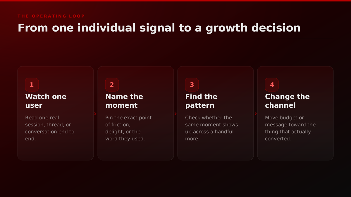
The discipline is in the second and third steps, because a single observation is an anecdote until you check it against a few more. One user getting stuck is noise. Five users getting stuck on the same field is a signal you can bet a sprint on. This is how the individual view avoids the trap people fear, that you overreact to one loud customer. You do not act on one, you act on the smallest pattern that repeats, which is usually visible after three to five individuals, not three to five thousand.
The weekly individual-signal cadence
STEPS- 01
Monday: watch
Sit through five real user sessions or first-time uses end to end, no skipping to the good part.
- 02
Tuesday: read the words
Pull the exact language from every won and lost sales and support thread from the past week.
- 03
Wednesday: trace one signup
Follow one real customer back to the specific clip, thread, or touch that actually started them.
- 04
Thursday: find the pattern
Check whether the moment you saw on Monday repeats across a handful of other individuals.
- 05
Friday: change one thing
Move a budget line or rewrite one live asset based on the single clearest individual signal you found.
Running this loop on a fixed weekly cadence is what separates teams that compound insight from teams that relearn the same lesson every quarter. The three-ring distribution model we use for launches is built on exactly this rhythm, watch the individual signal in the inner ring first, then scale only what actually moved a real person.
How we read growth at the individual level
The reason this is not just a philosophy post is that every FORKOFF service is instrumented against a single unit, not a blended total. That design choice is deliberate, and it is the operational form of everything above.
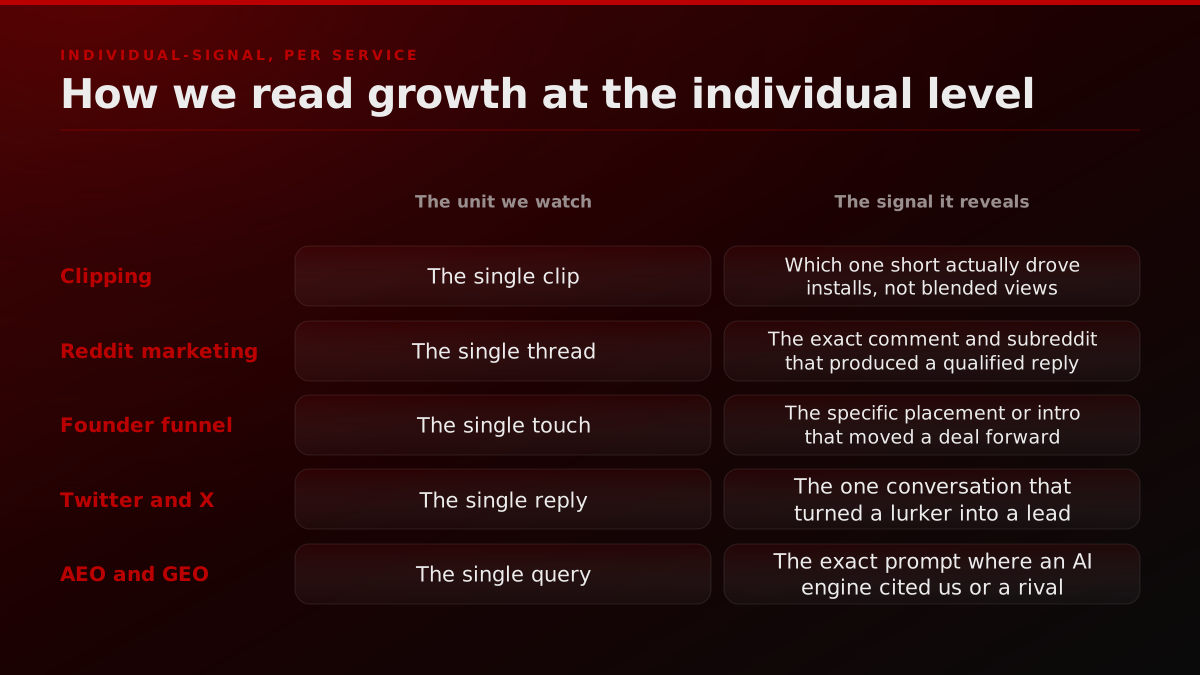
The mapping is concrete. Clipping is read by the single clip that drove installs. Reddit marketing is read by the exact thread and comment that produced a qualified reply, which is why we monitor intent threads individually rather than reporting a subreddit-level impression count. The founder funnel is read by the specific touch, the one placement, intro, or podcast appearance that measurably moved a deal forward. Twitter and X growth is read by the single reply that turned a lurker into a lead, not the follower delta. And in answer engine optimization and generative engine optimization, the unit is the exact query where an AI engine cited us or a competitor, because that one prompt is worth more than a thousand blended impressions. When influencer marketing is in the mix, the unit is the individual creator whose specific audience actually converted, not the sum of everyone's reach.
Clipping: which single clip actually drove the install
Clipping is the clearest place to see the aggregate trap, because view counts are the most seductive vanity metric in distribution. A campaign can post five million views and drive almost nothing, or post two hundred thousand views and drive a launch, and the total will never tell you which one you are running.
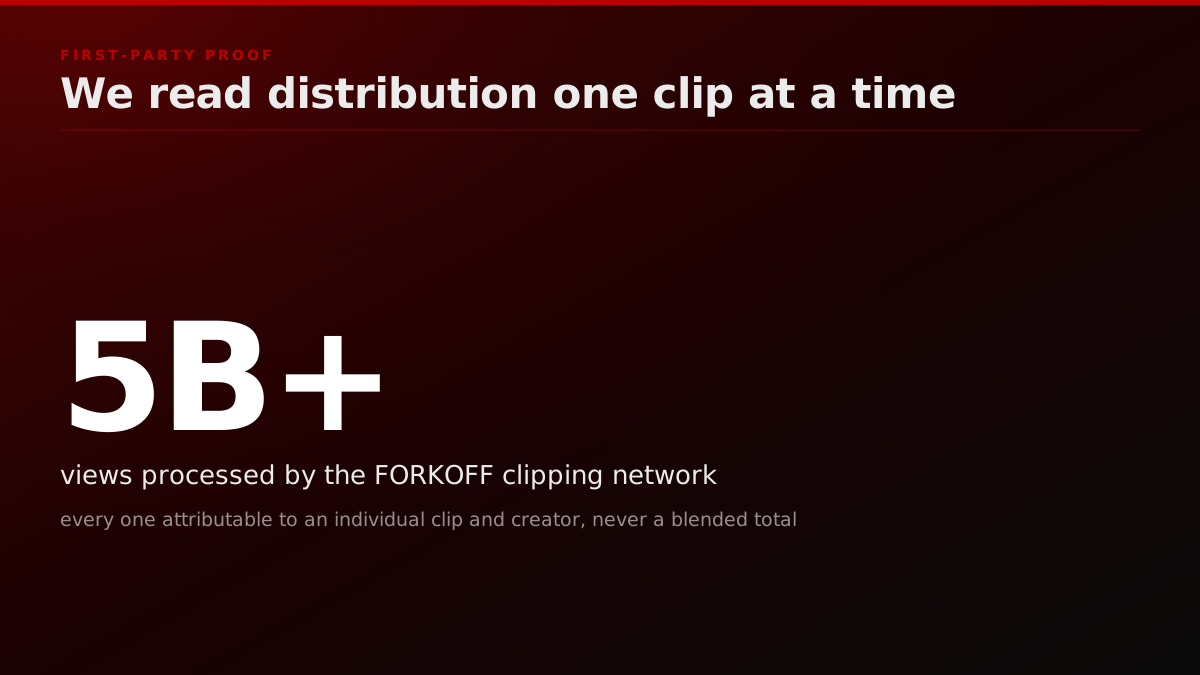
Our clipping network has processed more than 5 billion views, and the reason that number is useful to us is not its size. It is that every view is attributable to an individual clip, creator, and platform, so we can see which single short moved installs and which five million were ambient noise. That is the difference between a blended dashboard and an instrumented one, and it is the same difference Lieb draws between an aggregate product chart and a dot plot. Our clipping program is built to model this, what one genuinely converting channel is worth versus spreading the same budget evenly across all of them.
Operator note5B+ views processed across the FORKOFF clipping network, and every view traces to one clip, one creator, one platform., FORKOFF clipping network, 2026
Reddit: the one thread that produced a qualified reply
Reddit makes the point even more sharply, because on Reddit the aggregate is not just useless, it is misleading in a way that gets accounts banned. A team that reports Reddit performance as total impressions or karma is measuring the exact wrong thing, and usually optimizing toward behavior that the platform punishes.
The unit that matters on Reddit is the individual thread, and inside it, the individual comment. One genuinely helpful reply in a high-intent thread, where a real person described a real problem your product solves, is worth more than a hundred low-effort posts sprayed across twenty subreddits. We covered the sourcing side of this in our guide to the best subreddits for B2B SaaS founders, but the measurement side is the same principle as clipping, trace the qualified reply back to the one thread that produced it, then go find more threads that look like that one. The aggregate would have told you to post more. The individual signal tells you to post better, in a specific place, to a specific person.
There is a second-order benefit that only the individual view unlocks. When you read the exact thread that converted, you do not just learn that Reddit worked, you learn the precise phrasing of the problem in the words of someone who has it, the objections that came up in the replies, and the competitors people compared you to unprompted. That is a research goldmine a paid survey would take weeks and real money to produce, sitting in a thread that already converted for free. The same intelligence flows out of the highest-intent X and Twitter replies, which is why we treat every qualified conversation as both a lead and a piece of message research, not one or the other.
Operator noteReddit reports at FORKOFF name the exact thread URL behind every qualified reply. Karma totals never appear in them., FORKOFF Reddit marketing reporting
The founder funnel: the single touch that closed
The highest-stakes version of this is the founder funnel, because a founder's time is the scarcest budget line in the company and the aggregate is worst exactly here. A dashboard that says the founder did twelve podcasts, four events, and thirty warm intros last quarter, and pipeline grew, tells you nothing about which of those forty-six touches actually mattered. The three engines that produce those intros, and which one to instrument first, are at how to get inbound leads as a founder.
The individual signal does. Trace one closed deal back through its real history and you usually find a single touch that turned it, one specific podcast appearance a buyer mentioned, one conversation at one of the events we run, one intro from one person. That is the touch to run more of, and the forty-five others are candidates to cut. This is the entire logic of pricing a growth engagement on outcomes rather than activity, which we broke down in our piece on AI agency pricing and unit economics, you cannot price on outcomes if you only measure activity in aggregate. Founders evaluating whether to run this themselves or bring in outside help should ask exactly one diagnostic question, does the current reporting let you name the single touch that closed the last deal? If not, the growth function is flying on aggregates.
Operator noteFounder funnel reviews open with one question: name the single touch that moved the last closed deal., FORKOFF founder funnel
When aggregates actually earn their place
To be fair to the dashboard, there is a real job only the aggregate can do, and pretending otherwise is its own kind of naive. Once you have found a signal at the individual level and confirmed the smallest pattern that repeats, you scale it, and scaling is where the aggregate becomes indispensable. You cannot watch a million sessions. You can watch five, form a hypothesis, and then use the aggregate to check whether the change you shipped actually moved the number across the whole population. The individual view is for discovery, the aggregate is for validation, and a team that skips either half gets a predictable failure.
The teams that run this well treat the two as a relay, not a rivalry. Individual signal points to the bet. The aggregate confirms or kills it at scale. Then you drop back to the individual level to understand the next thing the new aggregate cannot explain. The mistake is not using dashboards, it is starting and ending there, letting a blended number both raise the question and pretend to answer it. Discovery lives with the person. Proof lives in the population. Most founders have the proof half wired and the discovery half missing entirely, which is why they can recite their conversion rate to two decimals and cannot name a single reason it is what it is.
Your individual-signal audit: what to do this week
None of this requires a new analytics platform. It requires a change in where you point your attention, and you can start this week with five moves.
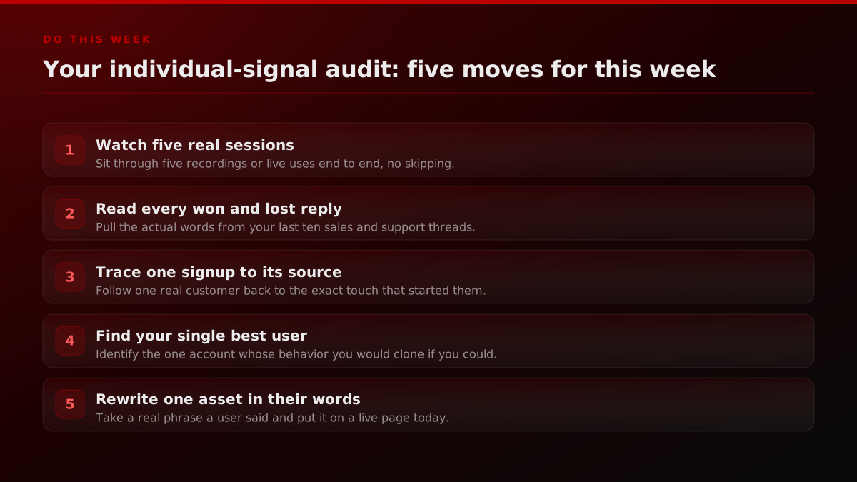
Watch five real user sessions end to end, no skipping to the interesting part. Read every won and lost sales and support reply from the past two weeks and pull the actual words people used. Trace one real signup back to the specific touch that started it. Find your single best user, the one account whose behavior you would clone if you could, and study what makes them different. Then rewrite one live page or one X post built to go viral using a real phrase a real user said, and watch what it does. Do that for a month and you will have more usable growth insight than a year of dashboard reviews produced, because you will have spent the month in front of specific people instead of blended totals. The idea, as Paul Graham puts it in How to Get Startup Ideas, is to notice what real, specific people actually need, and that noticing only happens up close.
The dashboard is not the enemy. It is the smoke alarm. It is very good at telling you something is happening and completely silent on what to do about it. The growth signal you are looking for, the one that tells you which channel to double, which message to ship, and which user to build for, is always one rung down, at the level of the individual. Go watch one.


![How to Make a Launch Go Viral on X: The 5-Lever Playbook [2026]](/blog/covers/how-to-make-launch-go-viral-on-x-2026-cover.jpg)